High impact, but visually lost in the crowd. We built a bold, high velocity brand for 10xerClub. Designed to stop the scroll, spark ambition, and position the program as a fast track for serious marketers.
About the Project
Visit 10xerClub


High impact, but visually lost in the crowd. We built a bold, high velocity brand for 10xerClub. Designed to stop the scroll, spark ambition, and position the program as a fast track for serious marketers.
10xerClub is not your average online course, it’s a real-world marketing accelerator designed to equip professionals with deep, industry relevant skills in a fraction of the time it takes to earn a traditional MBA. Led by proven experts, the program blends mentorship, strategic insight, and executional know how to create marketers who actually move the needle.
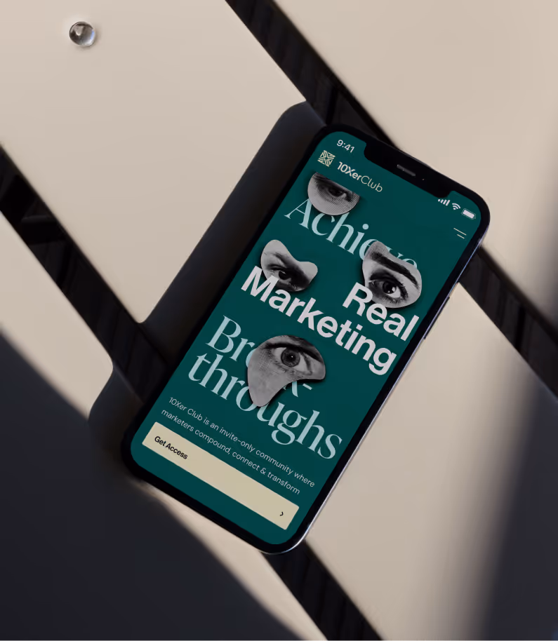
When they approached us, they had one clear objective, build a brand that stops the scroll. The identity needed to feel urgent, modern, and aspirational and designed for a generation of high-performers who aren’t just learning, but leaping.
The online course space is cluttered with generic promises and templated aesthetics. 10xerClub wanted no part of that.
Their ask? Create a visual identity that would stand out, especially on LinkedIn, where attention is scarce and competition is fierce. It needed to trigger curiosity, convey value instantly, and feel like an exclusive club people had to be part of. All without looking pretentious or inaccessible.
The tension we had to resolve: Aspirational, but real. Bold, but grounded. Elite—but still welcoming.
Through deep discovery and collaborative workshops, one idea kept surfacing: 10xerClub wasn’t just a course, it was a catalyst. So we built the brand around the idea of “Momentum of Mastery.”
This concept became our creative foundation, expressing how the program doesn’t just teach theory, but creates motion. It equips professionals to grow fast, act smarter, and build real momentum under the guidance of leaders who’ve already done it.
We designed a system that looks and feels like acceleration:
The overall feel? Energetic, driven, and unmistakably premium.
10xerClub’s new identity doesn't just look like a course. It looks like a movement.
It speaks directly to its ideal student, someone ambitious, busy, and unwilling to waste time. The brand now has the presence to dominate where it matters especially in high-scroll environments like LinkedIn. It evokes curiosity before it pitches value, which makes all the difference in a saturated market.
This isn’t just a visual upgrade, it’s a strategic shift in positioning. The new 10xerClub feels fast, smart, and built for people who are done waiting.