Smart, seamless, and built for creatives but the brand felt like just another SaaS. We crafted an identity with clarity, motion, and elegance that turns back-office automation into a bold creative advantage.
About the Project
Visit Opal


Smart, seamless, and built for creatives but the brand felt like just another SaaS. We crafted an identity with clarity, motion, and elegance that turns back-office automation into a bold creative advantage.
Opal is a platform built to take the operational chaos out of creative agencies. By automating back-office workflows, without compromising flexibility or control. It frees agency teams to focus on what they do best: creating exceptional work.
They came to us with a powerful product and a clear goal: build a brand, product interface, and website that reflect their vision which is simple, elegant, and distinctly creative. It had to feel as seamless as the experience they were selling.
Opal isn’t your average ops tool. But their early design language made it look like one technical, cold, and overly generic.
The challenge wasn’t just visual. We needed to translate invisible value, that is automation, clarity and time saved into a bold identity that resonated with design led teams. Every touchpoint had to speak to creative founders and ops minded partners alike, and show that behind Opal’s simplicity lies serious engineering.
And, they didn’t want it to feel like “just another SaaS”
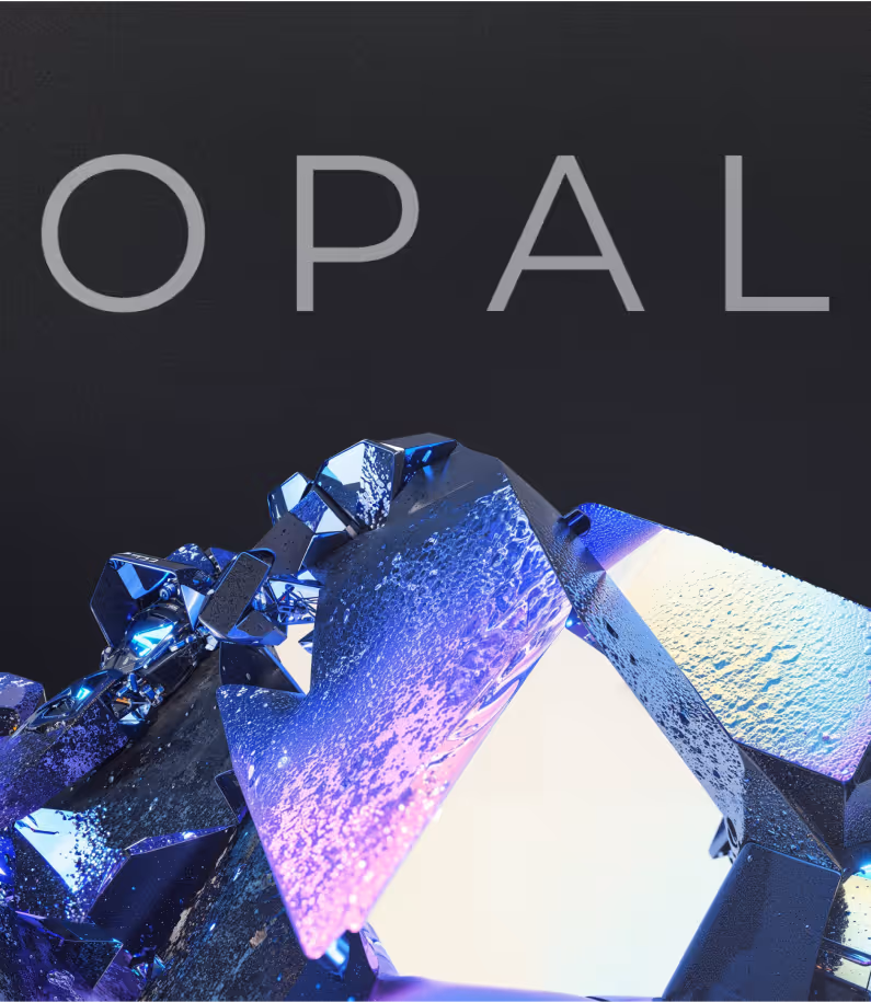
We built the brand around a perfect metaphor: the opal gemstone. A shape shifting symbol of clarity, depth, and creative structure. This idea became the cornerstone for everything.
A clean, luminous mark inspired by the opal’s layers. We paired that with shifting gradients, elegant type, and UI elements that feel intuitive, soft, and confident. The palette and system reflect both clarity and motion—hinting at what Opal does without overexplaining.
We overhauled the platform UX to align with the brand—lightweight, fast, and frictionless. Each screen was stripped to its essence, with thoughtful hierarchy and zero noise. We also introduced a modular system to scale future features without compromising elegance.
For the website, we created a bold, narrative-driven experience. The hero doesn’t tell you what Opal is—it shows you. Interactions are minimal but meaningful. Animations reflect motion and logic, reinforcing the product’s promise: “We work in the background, so you can lead from the front.”
The new Opal doesn’t beg for attention, it earns trust in seconds.
Creative founders now see a tool that gets them. The brand feels elevated but familiar. The product feels powerful but effortless. And the website? It converts curiosity into clarity, fast.
Most importantly, we helped position Opal not just as a tool, but as a mindset shift for growing agencies “Don’t just operate. Flow.”
The rebrand and redesigned Webflow site elevated RightData’s presence to match the sophistication of their platform. The new visual language positioned them as a future-ready leader in the data space, making complex concepts feel intuitive and engaging.
The updated identity brought clarity to their offerings, helping clients and stakeholders better understand the distinct value of DataTrust, DataFactory, and DataMarket, while reinforcing the idea of a cohesive, interconnected ecosystem. The brand now reflects RightData’s core strengths: innovation, precision, and a clear vision for the future of data infrastructure.