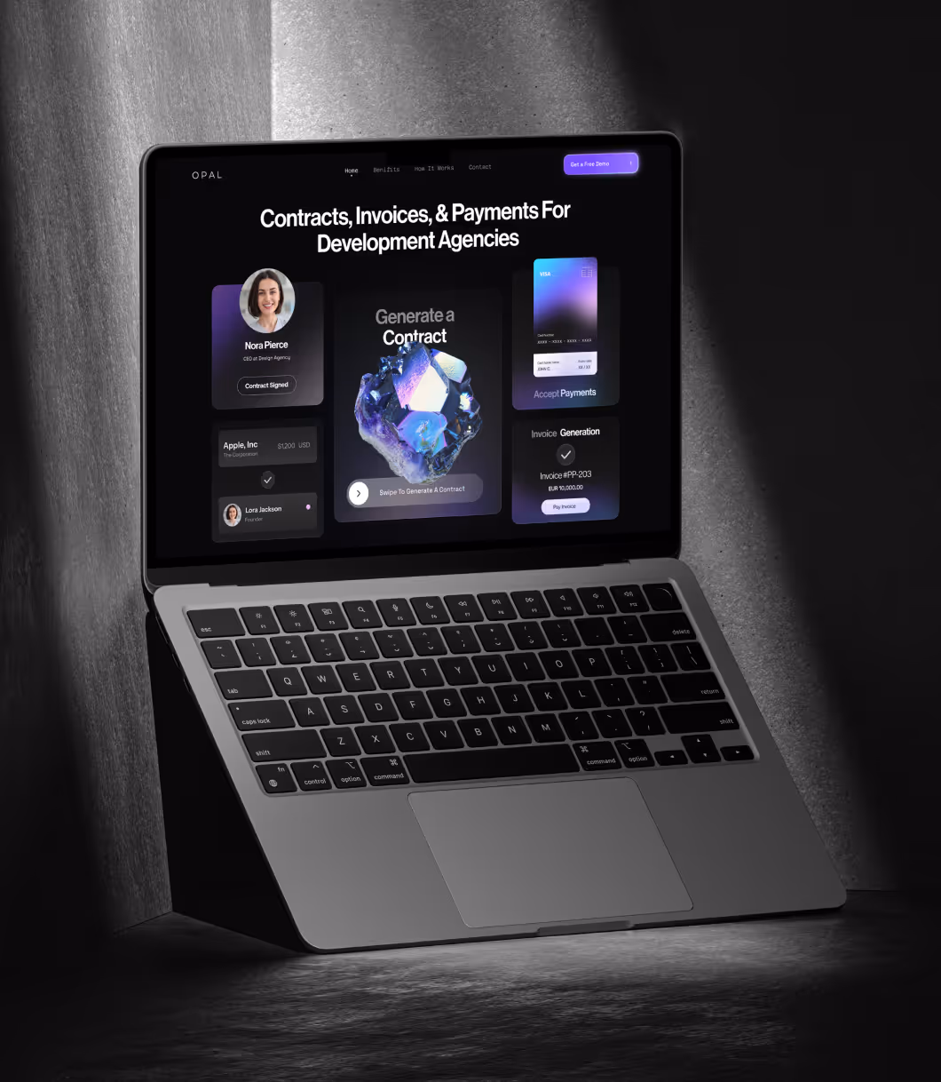
Opal is a platform built to take the operational chaos out of creative agencies. By automating back-office workflows, without compromising flexibility or control. It frees agency teams to focus on what they do best: creating exceptional work.
They came to us with a powerful product and a clear goal: build a brand, product interface, and website that reflect their vision which is simple, elegant, and distinctly creative. It had to feel as seamless as the experience they were selling.
“Opal is transforming your billing process with automated charge capture technology! .”
Opal isn’t your average ops tool. But their early design language made it look like one technical, cold, and overly generic.
The challenge wasn’t just visual. We needed to translate invisible value, that is automation, clarity and time saved into a bold identity that resonated with design led teams. Every touchpoint had to speak to creative founders and ops minded partners alike, and show that behind Opal’s simplicity lies serious engineering.
And, they didn’t want it to feel like “just another SaaS”
.avif)
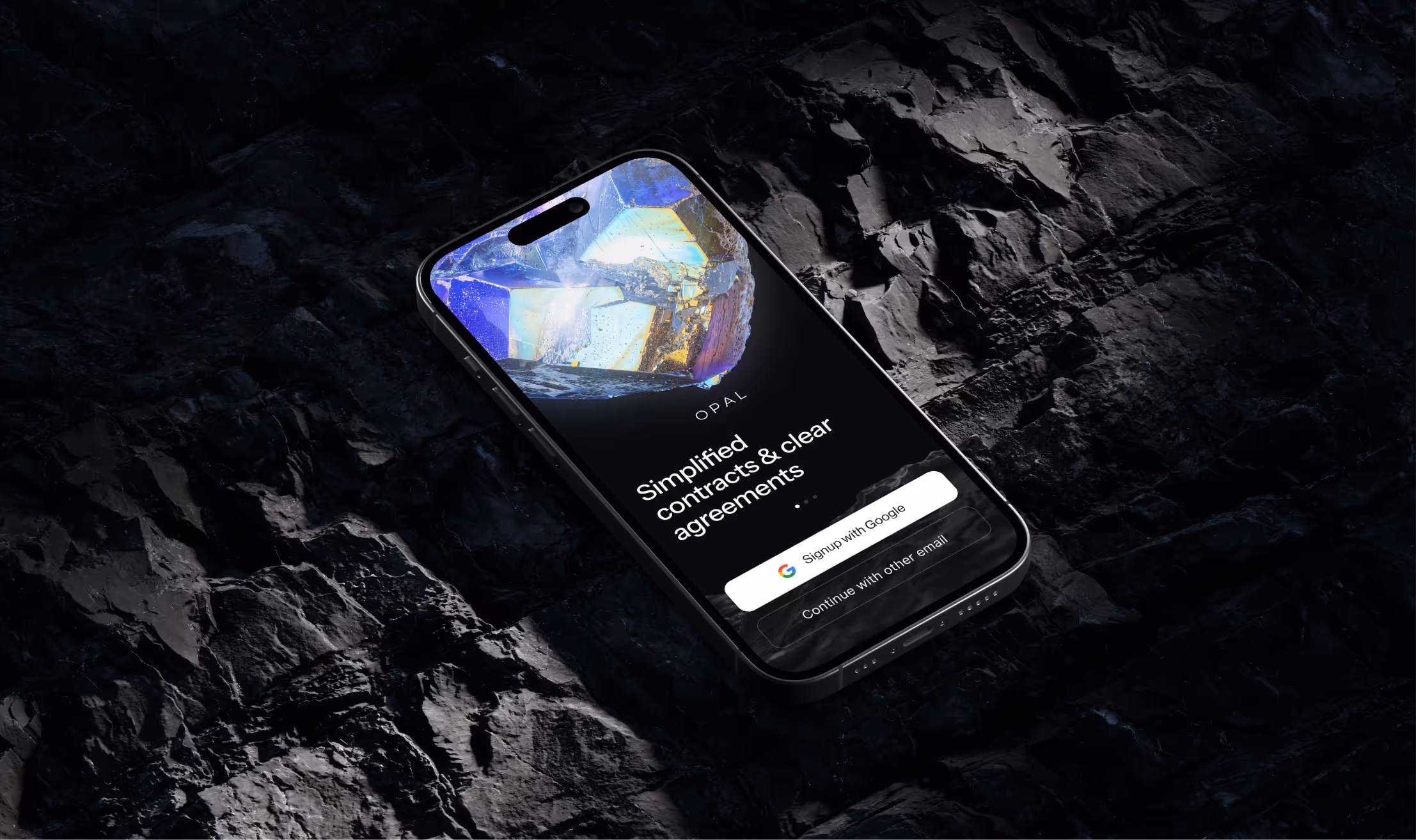
We built the brand around a perfect metaphor: the opal gemstone. A shape shifting symbol of clarity, depth, and creative structure. This idea became the cornerstone for everything.
.avif)

.avif)

.svg)


'%3e%3cg id='Final-Copy-2_2_' transform='translate(1275.000000, 200.000000)'%3e%3cpath class='st0' d='M7.4,12.8h6.8l3.1-11.6H7.4C4.2,1.2,1.6,3.8,1.6,7S4.2,12.8,7.4,12.8z'/%3e%3c/g%3e%3c/g%3e%3c/g%3e%3cg id='final---dec.11-2020'%3e%3cg id='_x30_208-our-toggle' transform='translate(-1275.000000, -200.000000)'%3e%3cg id='Final-Copy-2' transform='translate(1275.000000, 200.000000)'%3e%3cpath class='st1' d='M22.6,0H7.4c-3.9,0-7,3.1-7,7s3.1,7,7,7h15.2c3.9,0,7-3.1,7-7S26.4,0,22.6,0z M1.6,7c0-3.2,2.6-5.8,5.8-5.8 h9.9l-3.1,11.6H7.4C4.2,12.8,1.6,10.2,1.6,7z'/%3e%3cpath id='x' class='st2' d='M24.6,4c0.2,0.2,0.2,0.6,0,0.8l0,0L22.5,7l2.2,2.2c0.2,0.2,0.2,0.6,0,0.8c-0.2,0.2-0.6,0.2-0.8,0 l0,0l-2.2-2.2L19.5,10c-0.2,0.2-0.6,0.2-0.8,0c-0.2-0.2-0.2-0.6,0-0.8l0,0L20.8,7l-2.2-2.2c-0.2-0.2-0.2-0.6,0-0.8 c0.2-0.2,0.6-0.2,0.8,0l0,0l2.2,2.2L23.8,4C24,3.8,24.4,3.8,24.6,4z'/%3e%3cpath id='y' class='st3' d='M12.7,4.1c0.2,0.2,0.3,0.6,0.1,0.8l0,0L8.6,9.8C8.5,9.9,8.4,10,8.3,10c-0.2,0.1-0.5,0.1-0.7-0.1l0,0 L5.4,7.7c-0.2-0.2-0.2-0.6,0-0.8c0.2-0.2,0.6-0.2,0.8,0l0,0L8,8.6l3.8-4.5C12,3.9,12.4,3.9,12.7,4.1z'/%3e%3c/g%3e%3c/g%3e%3c/g%3e%3c/g%3e%3c/svg%3e) Your Privacy Choices
Your Privacy Choices