RightData is a forward thinking platform that turns raw data into actionable business insights through a powerful, AI-driven, no-code toolkit. With three flagship offerings, DataTrust, DataFactory, and DataMarket. With these RightData empowers organizations to build a reliable, streamlined data infrastructure.
They approached Pixeto to reimagine their brand identity and design a modern Webflow website that could clearly communicate their complex capabilities in a way that felt futuristic, intuitive, and compelling across both technical and business audiences.

“ RightData’s platform is technically sophisticated, but their existing identity failed to capture that complexity in a way that was accessible or memorable.”
The key challenge was simplification without dilution. RightData’s platform is technically sophisticated, but their existing identity failed to capture that complexity in a way that was accessible or memorable. We needed to create a visual and verbal language that would resonate with data engineers and decision makers, while clearly distinguishing between the three service pillars, all under a unified ecosystem.
With all of the information that we gathered so far, our goal was clear: elevate Datamede’s sophistication. We wanted to ensure that while the essence remained intact, the brand felt fresh, modern, and in step with the times. Our mission was clear, partnership stood as a strong pillar for us. Working closely with the Datamede team, we embarked on a collaborative rebranding journey. It wasn't about changing who they were, but about enhancing their image to resonate with today's audience.
The outcome? A logo that's sharper, encapsulating both their legacy and their forward-thinking approach. Colours that aren't just trendy but tell a story of reliability and trust. And illustrations that breathe life, energy, and innovation into every interaction.

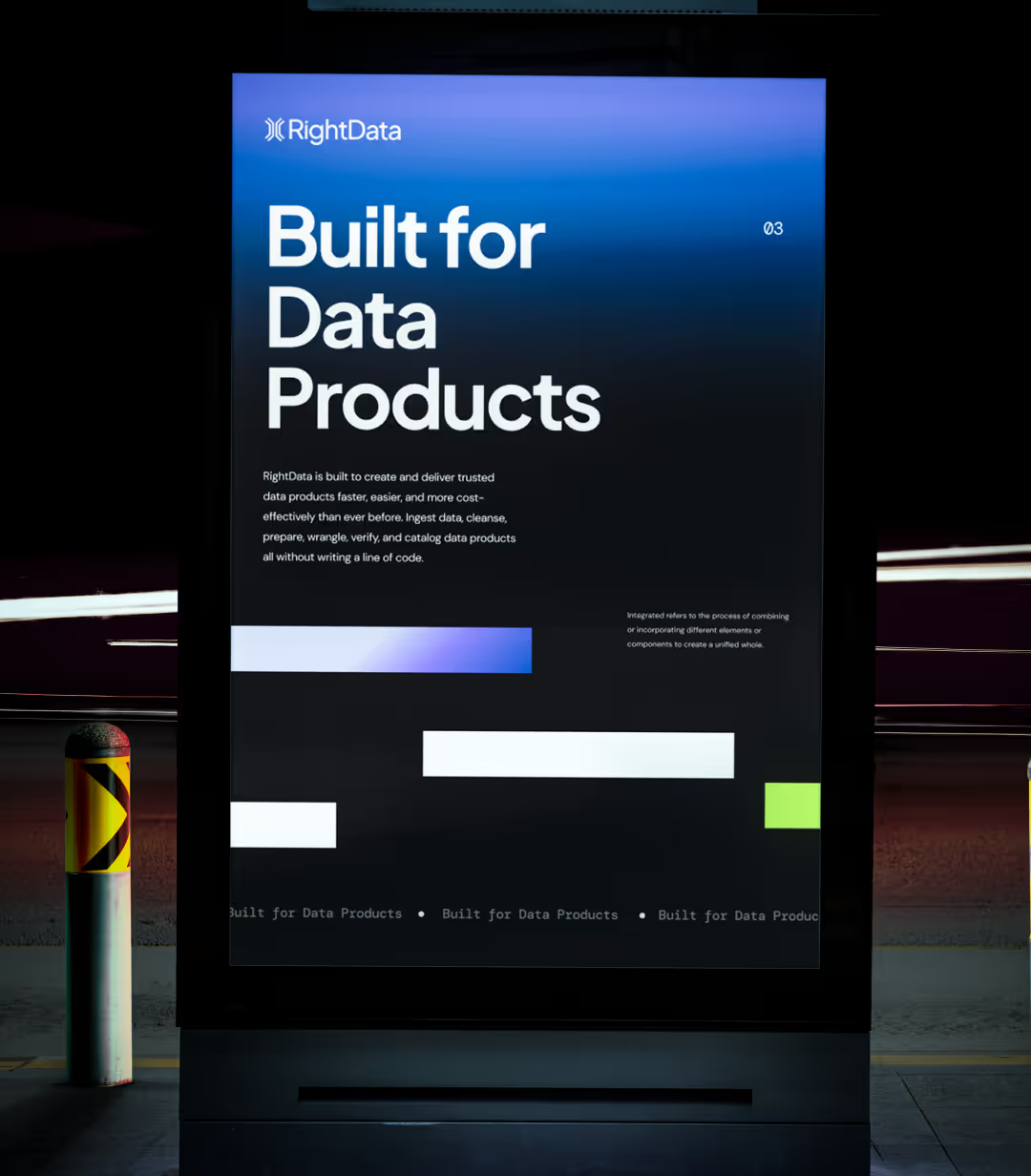
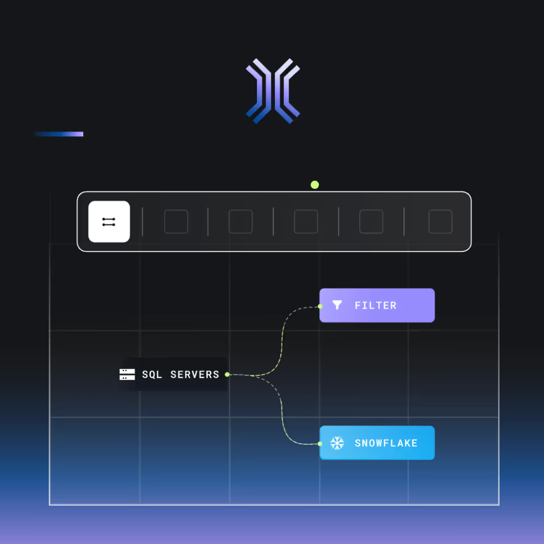
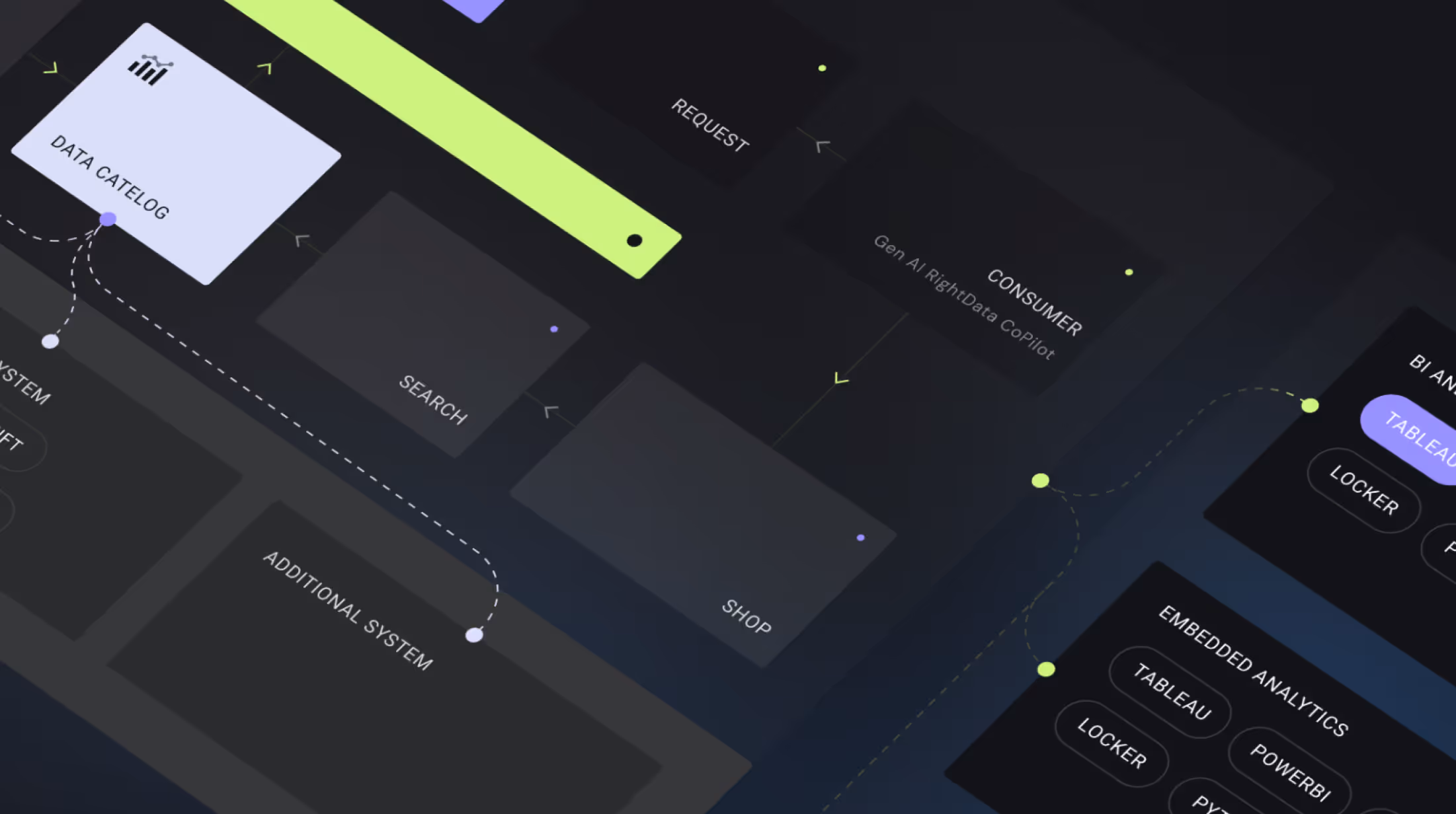
We grounded the new identity in the metaphor of a wormhole. A seamless, intelligent conduit for moving data swiftly and accurately across systems. The new logo captures this flow with a clean, continuous form, symbolizing speed, trust, and transformation.
To bring this idea to life across the website, we introduced:
- Deep gradients in purples and blues to evoke a futuristic, trustworthy tone
- Thin lines and animated visuals to represent data pathways and interactions
- Dot based diagrams for illustrating complex concepts with simplicity
- Outline icons to maintain minimal clarity while enhancing UX
- Monospace typography, a nod to the platform’s technical roots, for a balanced and modern feel
.avif)

.svg)


'%3e%3cg id='Final-Copy-2_2_' transform='translate(1275.000000, 200.000000)'%3e%3cpath class='st0' d='M7.4,12.8h6.8l3.1-11.6H7.4C4.2,1.2,1.6,3.8,1.6,7S4.2,12.8,7.4,12.8z'/%3e%3c/g%3e%3c/g%3e%3c/g%3e%3cg id='final---dec.11-2020'%3e%3cg id='_x30_208-our-toggle' transform='translate(-1275.000000, -200.000000)'%3e%3cg id='Final-Copy-2' transform='translate(1275.000000, 200.000000)'%3e%3cpath class='st1' d='M22.6,0H7.4c-3.9,0-7,3.1-7,7s3.1,7,7,7h15.2c3.9,0,7-3.1,7-7S26.4,0,22.6,0z M1.6,7c0-3.2,2.6-5.8,5.8-5.8 h9.9l-3.1,11.6H7.4C4.2,12.8,1.6,10.2,1.6,7z'/%3e%3cpath id='x' class='st2' d='M24.6,4c0.2,0.2,0.2,0.6,0,0.8l0,0L22.5,7l2.2,2.2c0.2,0.2,0.2,0.6,0,0.8c-0.2,0.2-0.6,0.2-0.8,0 l0,0l-2.2-2.2L19.5,10c-0.2,0.2-0.6,0.2-0.8,0c-0.2-0.2-0.2-0.6,0-0.8l0,0L20.8,7l-2.2-2.2c-0.2-0.2-0.2-0.6,0-0.8 c0.2-0.2,0.6-0.2,0.8,0l0,0l2.2,2.2L23.8,4C24,3.8,24.4,3.8,24.6,4z'/%3e%3cpath id='y' class='st3' d='M12.7,4.1c0.2,0.2,0.3,0.6,0.1,0.8l0,0L8.6,9.8C8.5,9.9,8.4,10,8.3,10c-0.2,0.1-0.5,0.1-0.7-0.1l0,0 L5.4,7.7c-0.2-0.2-0.2-0.6,0-0.8c0.2-0.2,0.6-0.2,0.8,0l0,0L8,8.6l3.8-4.5C12,3.9,12.4,3.9,12.7,4.1z'/%3e%3c/g%3e%3c/g%3e%3c/g%3e%3c/g%3e%3c/svg%3e) Your Privacy Choices
Your Privacy Choices