The Ultimate Guide to B2B Website Best Practices
.avif)
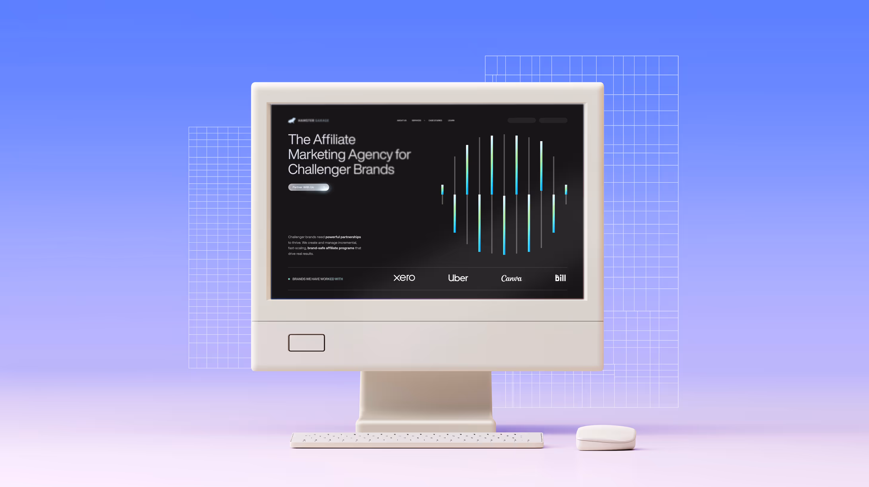
.png)
.png)

.png)
.png)
If your B2B website still feels like it was built when dial-up was a thing, it’s time for an upgrade. Many brands still treat their site like a digital brochure - polite, polished, and passive.
But in 2025, an effective B2B website isn’t about appearance. It’s about performance. Your website isn’t just a page; it’s your sharpest salesperson. One that never asks for coffee breaks and works even when you’re asleep.
Here’s the catch: modern buyers don’t browse, they validate. They land, skim, compare, and decide in seconds whether you’re worth another click. In that instant, clarity beats cleverness, speed outruns beauty, and structure wins over storytelling fluff.
So, in a world where attention is short, decisions are collective, and trust is the new currency, here’s how to build a website following B2B website best practices that actually sells before your sales team says a word.
What Is B2B Website Design?
B2B website design best practices define how effectively the website helps one business understand, evaluate, and trust another. Done well, your site guides a buyer like a GPS, clear turns, no unnecessary detours. Done poorly, it feels like a roundabout with no exits.
Unlike B2C, where emotion drives decisions, B2B design deals in proof. You’re not convincing one person to click “Add to Cart,” you’re helping five to ten people agree that you’re the right partner. Your site must help the CFO see value, the IT head see security, and the end user see simplicity, all at once.
In a way, good B2B design works like Netflix, it predicts what someone needs next and serves it before they even have to search.
Brands like Atlassian and Notion do this beautifully. Their sites don’t oversell. They explain. They use clarity as a sales strategy, and it works.
At its best, your website is your digital handshake: firm, confident, and reassuring enough that they want the meeting to continue.
Core Objectives
- Build trust fast - Buyers don’t want promises. They want proof - case studies, results, credentials.
- Generate and nurture leads - Design journeys that guide prospects from curiosity to confidence.
- Bridge marketing and sales - Every page should support a measurable next step.
As Ashok says, “Good B2B website best practices don’t chase leads; they earn them, pixel by pixel.”
Why Website Design Matters in B2B
Your website is the first sales meeting you’ll never attend. And it’s shorter than a blink. 0.05 seconds, that’s all it takes for someone to judge your credibility.
That’s faster than your sales rep can say hello, and if your homepage confuses them in that blink, you’ve already lost the deal before it began.
B2B website best practices says good design isn’t about gradients or gimmicks, it’s about how confidently your brand communicates competence. A friction-free site tells visitors, “We know what we’re doing, and we’ll make your life easier too.”
Research from the Stanford Web Credibility Project shows that visual design strongly shapes how trustworthy a website feels, people often judge credibility within seconds based on look and feel. Nielsen Norman Group adds that B2B users, juggling multiple vendor tabs, make these decisions even faster.
Following B2B website design best practices ensures your site performs, not just looks good. It directly impacts lead generation, conversion rate optimization, trust, among others. A slow or cluttered site, on the other hand, is like a salesperson who shows up late and forgets their notes, it quietly drains millions in potential pipeline.
How to Create a B2B Website That Actually Performs
Designing a high-performing site isn’t guesswork, it’s understanding how real buyers think, choose, and act. The following B2B website best practices can help your brand turn visitors into believers.
Step 1: Understand your audience
Forget single “personas.” In 2025, you’re designing for buying committees, think more Avengers-style teamwork.
Forrester’s 2024 Buyers’ Journey Survey found that an average of 13 people are involved in enterprise purchase decisions.
Each of them cares about something different: ROI, usability, scalability, or just peace of mind. Your site needs to talk to all of them, clearly, quickly, and without drowning anyone in jargon. Use layered navigation, surface key info, let deeper proof live one click away.
Step 2: Define a value proposition that survives a five-second test
If a visitor can’t answer “Why you?” within five seconds, they’ll bounce. Be painfully specific:
- “Reduce AR days by 35%.”
- “Deploy in under two weeks.”
- “Cut manual reporting time by 80%.”
Buzzwords blur. Numbers convince. Show outcome > effort. According to B2B website best practices, that’s how credibility is earned online.
Look at HubSpot’s homepage. Within one glance, it communicates what they do, who it’s for, and the impact. No jargon. Just clarity that converts.
Step 3: Design for User Experience (UX)
Creativity grabs attention. Clarity keeps it. Modern buyers are drowning in cognitive load. If your layout feels like a Christopher Nolan plot, beautiful but impossible to follow, you’ve already lost them.
Keep navigation intuitive, use whitespace generously, and make CTAs impossible to miss.
Accessibility isn’t optional anymore. Decision-makers browse from airport lounges, tablets, and dark-mode desktops. Your clean layout and focused messaging becomes their relief.
Pro Tip: If you can remove an element without hurting comprehension, do it. The unsaid rule in B2B web design best practices say every unnecessary shape, sentence, or colour adds decision fatigue.
Step 4: Craft a smart content Strategy
Your content is your credibility. Case studies, whitepapers, and blogs aren’t fluff, they’re proof points. Optimise for SEO best practices but write for human logic. When your content teaches something useful, both Google and buyers notice.
A great blog answers unasked questions, like:
- “Will this work with my existing tools?”
- “How quickly will we see ROI?”
When your content educates, buyers trust you before your demo, a foundation of B2B website design best practices.
Take Salesforce’s State of Sales report. It is a perfect example, it doesn’t push products, it publishes insights. The result? Millions of views, backlinks, and credibility that sells quietly.
Step 5: Build for Lead Generation and Conversion
CTAs shouldn’t play hide-and-seek. Place them where interest peaks, not where attention dies.
Common Mistake: Designing CTAs around what you want (book a demo) instead of what they need (see proof).
What you can learn is to replace polite “Submit” buttons with outcomes:
- “Get My Audit”
- “Book a Strategy Call”
- “See It in Action”
Pro Tip: Place your strongest social proof (logos, testimonials) directly above CTAs, users trust momentum, not persuasion. Trust elements are non-negotiable in B2B website best practices for conversion.
Step 6: Test → Measure → Improve
Even great websites age fast.
Run A/B tests monthly, watch heatmaps to see real behaviour, and use insights to iterate.
The Caveman used to guess what worked. Ashok checks the analytics, smiles, and quietly tweaks a headline. Guess whose funnel performs better?
These iterative habits define modern B2B website best practices - consistency, testing, and refinement.
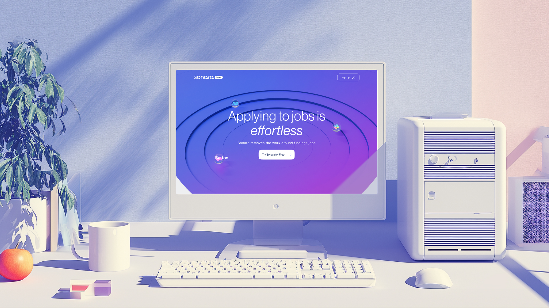
.avif)
7 Best-in-Class B2B Website Examples
These brands prove that function and flair can coexist when following B2B website best practices.
1. Zoho - SaaS for Business Productivity
Clean, modular, lightning-fast. Every page says “simplicity scales.”
Lesson: Clarity beats flash, complex products explained simply always win.
2. Freshworks - Customer Engagement Solutions
Real stories, vibrant visuals, contextual CTAs.
Lesson: Storytelling builds trust faster than features ever can.
3. Razorpay – Fintech and Payments
Bold design, data-backed proof, strong security cues.
Lesson: Trust signals are not decoration, they’re currency.
4. Slack – Workplace Collaboration
Minimalism that feels human. Even their micro-copy says, “We get how you work.”
Lesson: When your product simplifies chaos, your design should whisper calm.
5. Mailchimp – Marketing Platform
Playful tone, consistent UX, purposeful motion.
Lesson: Personality is memorable when it supports clarity.
6. TCS Digital – Enterprise Transformation
Structured, credible, and elegantly corporate.
Lesson: Big-ticket trust comes from precision, not noise.
7. HubSpot – Marketing Automation
Textbook content strategy: blog, academy, templates.
Lesson: Educate first. Sell later. Loyalty follows.
These are living examples of B2B web design best practices done right. Each blends storytelling, UX, and proof, showing that performance isn’t about louder design but smarter behaviour.
Checklist for B2B Website Best Practices
These are the B2B website best practices every brand should master. If you do nothing else, start here.
- Mobile-first design - Mobile influences 60% of B2B purchases
- Fast loading - Every second delay cuts conversions by 7%.
- Crystal-clear messaging - Explain what you do and for whom in one line.
- Optimised CTAs & forms - Fewer fields, higher completion.
- High-quality visuals - Clarity > complexity.
- Trust signals - Testimonials, certifications, case studies.
- SEO-aligned content - Intent-based topics, internal links.
- Accessibility - Inclusive design is good business.
- Analytics & testing - Data reveals what users won’t say.
A great website works like your top sales rep, responsive, informed, and never off duty. Or in Pixeto terms: your Tony Stark in the digital room, intelligent, fast, and impossible to ignore.
Conclusion
A high-performing B2B website isn’t a design project. It’s proof that your brand understands its buyers better than your competitors do. When every pixel clarifies your value and every click builds confidence, your website stops being a brochure and starts being a belief system.
Caveman once filled his homepage with pop-ups. Ashok simplified his hero line to a single sentence. Guess who got the call back?
At Pixeto, we don’t just design websites. We build digital salespeople that win trust before your team ever picks up the phone.
That’s what clarity, design, and data can do together, the true essence of B2B website best practices.
FAQs
1. What is the primary difference between B2B and B2C website design?
B2B websites are built for longer, more complex decisions.
They need to convince multiple stakeholders with data, clarity, and proof.
B2C websites focus on quick emotional triggers that drive instant purchases.
2. How important is mobile optimization for B2B websites?
Extremely important. Most B2B research now starts on mobile, and a poor mobile experience can end the conversation before it begins. If your site isn’t fast and easy to use on every device, buyers move on.
3. What role does SEO play in B2B website design?
SEO helps the right buyers discover you at the right time. It’s what connects your expertise with real search intent. Without it, even a great website stays hidden.
4. How can I improve lead generation through my website?
Guide visitors instead of overwhelming them. Use clear CTAs, short forms, and visible proof like testimonials or case studies. Offer valuable content that educates first and sells naturally.
5. What are some common mistakes to avoid in B2B website design?
The biggest ones are slow load times, vague messaging, and cluttered pages.
Don’t hide CTAs or overuse jargon. A good site makes it obvious what you do and how to take the next step.
6. How long does it take to build an effective B2B website?
Most well-planned B2B websites take 8 to 16 weeks to design and launch. After that, continuous updates and testing keep it performing at its best.
7. Which B2B website features improve trust and credibility the most?
Proof builds trust. Show real results, client logos, testimonials, certifications, and strong security signals like HTTPS. Add consistent visuals and easy navigation for a professional experience.
8. Can small B2B companies implement these best practices?
Yes. Strong messaging, simple design, and fast loading don’t require a big budget.
Even small teams can build high-performing websites by focusing on clarity and usability.
9. How do you measure the ROI of a B2B website redesign?
Measure what impacts business outcomes. Track leads, conversion rates, demo requests, and revenue tied to web traffic. When the right visitors turn into qualified leads faster, the redesign is paying off.


.svg)

