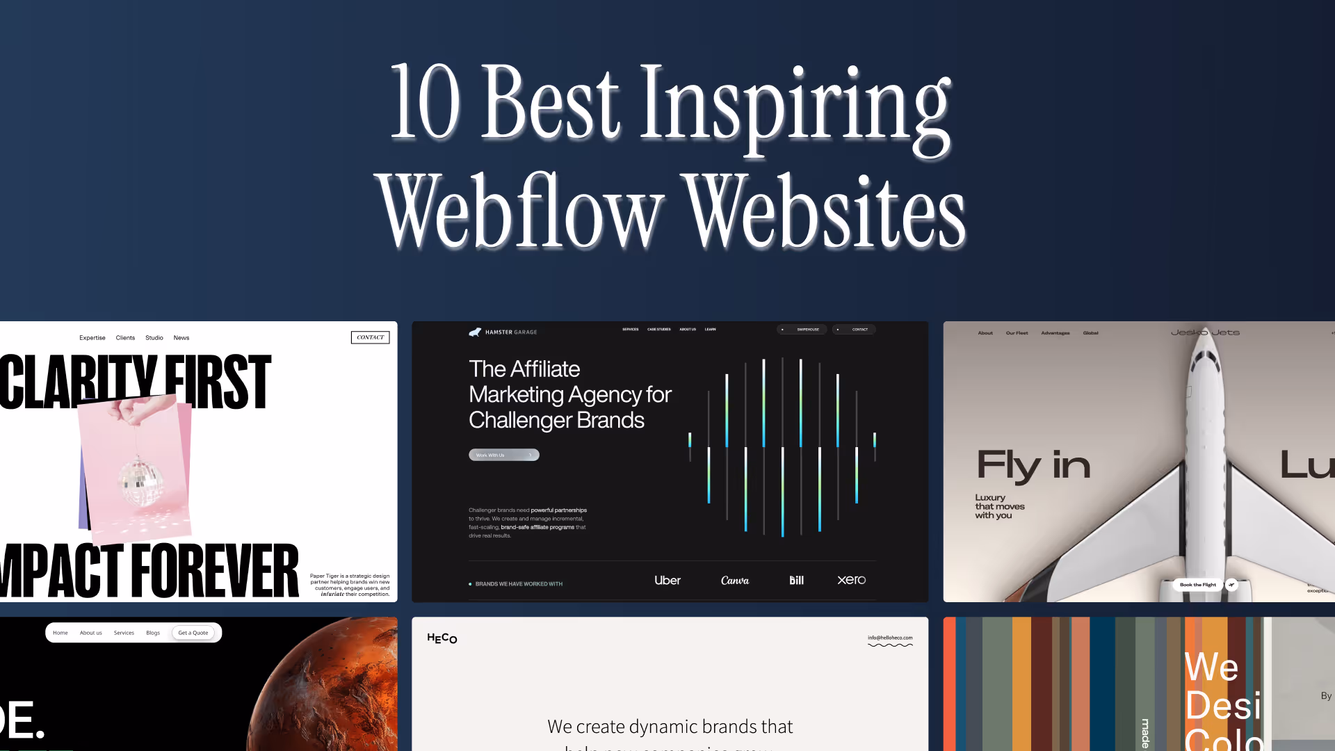
10 Best Webflow Websites for Design Inspiration
.avif)
.png)
.png)

.png)
.png)
Stuck in a design limbo? You’ve landed in the perfect place to ignite your creativity. Scroll on for some of the best Webflow websites and be inspired for your next masterpiece!
What Makes Webflow a Top Website Builder
Before we get into the top 10 best-designed websites on Webflow, let’s dig into why Webflow is the website builder everyone must choose.
- It scores brownie points for its design flexibility, thanks to its no-code dev base and intuitive visual interface that makes designing websites pure play.
- It has one of the most unparalleled and powerful CMSs, standing on its own brilliance. Webflow’s CMS can handle the most complex of designs while your website doesn’t let out as much as a cough.
- It is super popular amongst designers, agencies, SaaS startups, and e-commerce brands due to its powerful capability, in-built growth-led features, and its focus on moving with the times.
10 Best Webflow Websites to Inspire Your Next Design
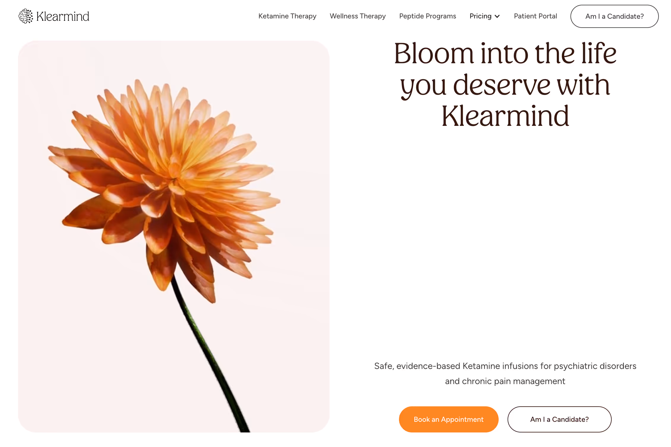
1. Klearmind
Designed at Pixeto, Klearmind’s website looks like a well-organised mind on display. Driven by its clean minimal Webflow design and calming layout, each section is built to move you with intent. See it for yourself. They use white space cleverly with a goal to create an easy-to-follow rhythm.
What really stands out here is its service-led experience. You know what the brand is about within seconds. The choice of visuals lends a nice aesthetic that completely matches the brand tone.
2. Hamster Garage
Crafted at Pixeto, Hamster Garage aces the premium touch that works so well for brands looking to position themselves in the same vein. From the moment you land on the site, your eyes are focussed on the communication.
Each section is strategically thought to offer readers a brand overview with purposeful CTAs. Check them out for yourself.

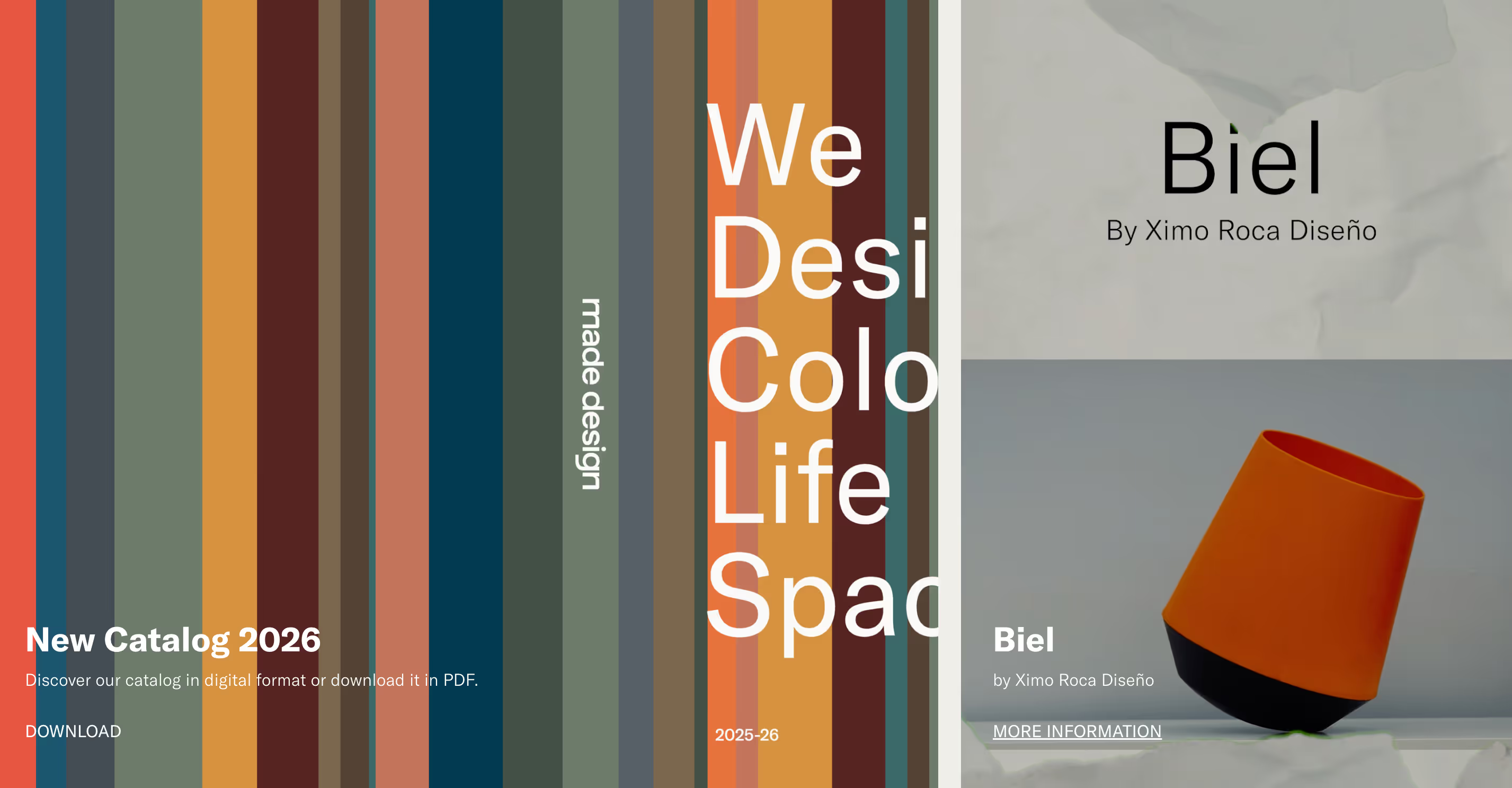
3. MADE Design
MADE Design’s feels like picking up an editorial magazine. They merge creativity with strategy with a deliberate thought to each scroll. Transitions guide you from one idea to the next, helping you understand their offerings in a therapeutic way.
What really stands out here is their portfolio presentation. They don’t use flashy effects, instead, they focus on slowness, structure and showcase products that match their core branding. It’s a great inspiration for creatives who want to showcase craft in a non-flashy, yet powerful way. Get inspired if you want to build a standout Webflow portfolio.
4. Heco
Heco’s website immediately pulls you in. They use warm colours, soft transitions, nearly therapeutic motions that make visitors pause in a constantly on digital world.
Story-telling is at the core of their website with each layout working to its favour. What really stands out here is how they’ve aced feeling over formulas, showing how design can be expressive and how images can speak a thousand words. Get inspired by their minimalist Webflow design here.

5. Zenith Studio
Zenith Studio’s website has cracked the fun one can have with motion. This design aspect perfectly goes in sync with their branding as they offer contemporary digital experiences for brands.
What really stands out here is the balance of motion and calm compositions which creates a premium, almost meditative experience. It’s a beautiful example of how less speed can create more impact. Watch it for yourself.

6. Paper Tiger
Paper Tiger’s site feels like a really cool print magazine. Their layouts are bold, intentional and lend a joyful touch to the way they unfold with each scroll. If you’re looking to push your creative boundaries, here’s a striking example.
What really stands out here is the impactful typography, use of colour, and motion work to create a unique brand personality. If you’re a studio looking to stand out, this website made on Webflow definitely offers some great inspiration. Explore now.

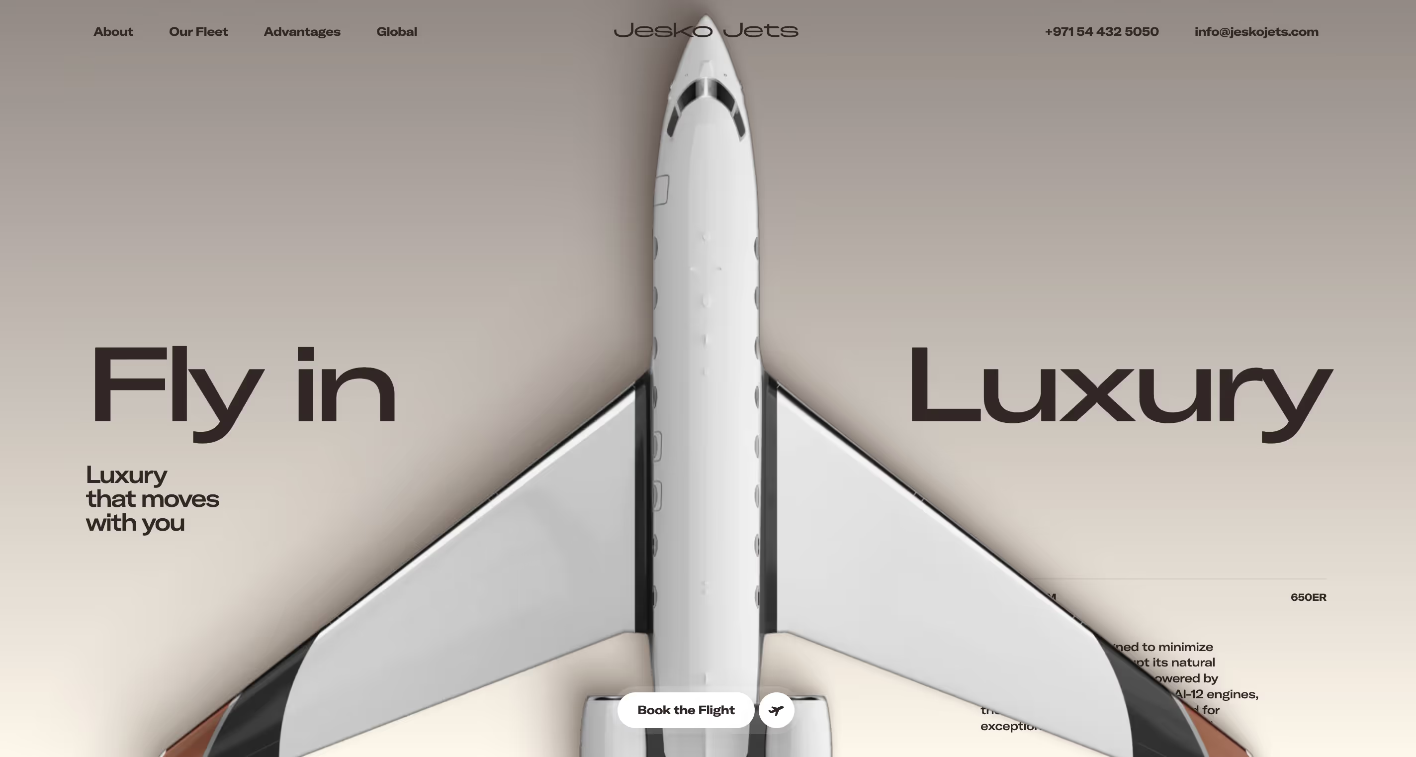
7. Jesko Jets
Jesko Jets’ website keeps its premium offerings at the forefront with the choice of color and smart use of whitespace. This creates a structure that focusses on the core offerings of the brand.
What really stands out here is how alignment adds to this immersive experience. Every interaction reinforces the brand narrative, making it a great example in experiential branding through web design. Get inspired right here.
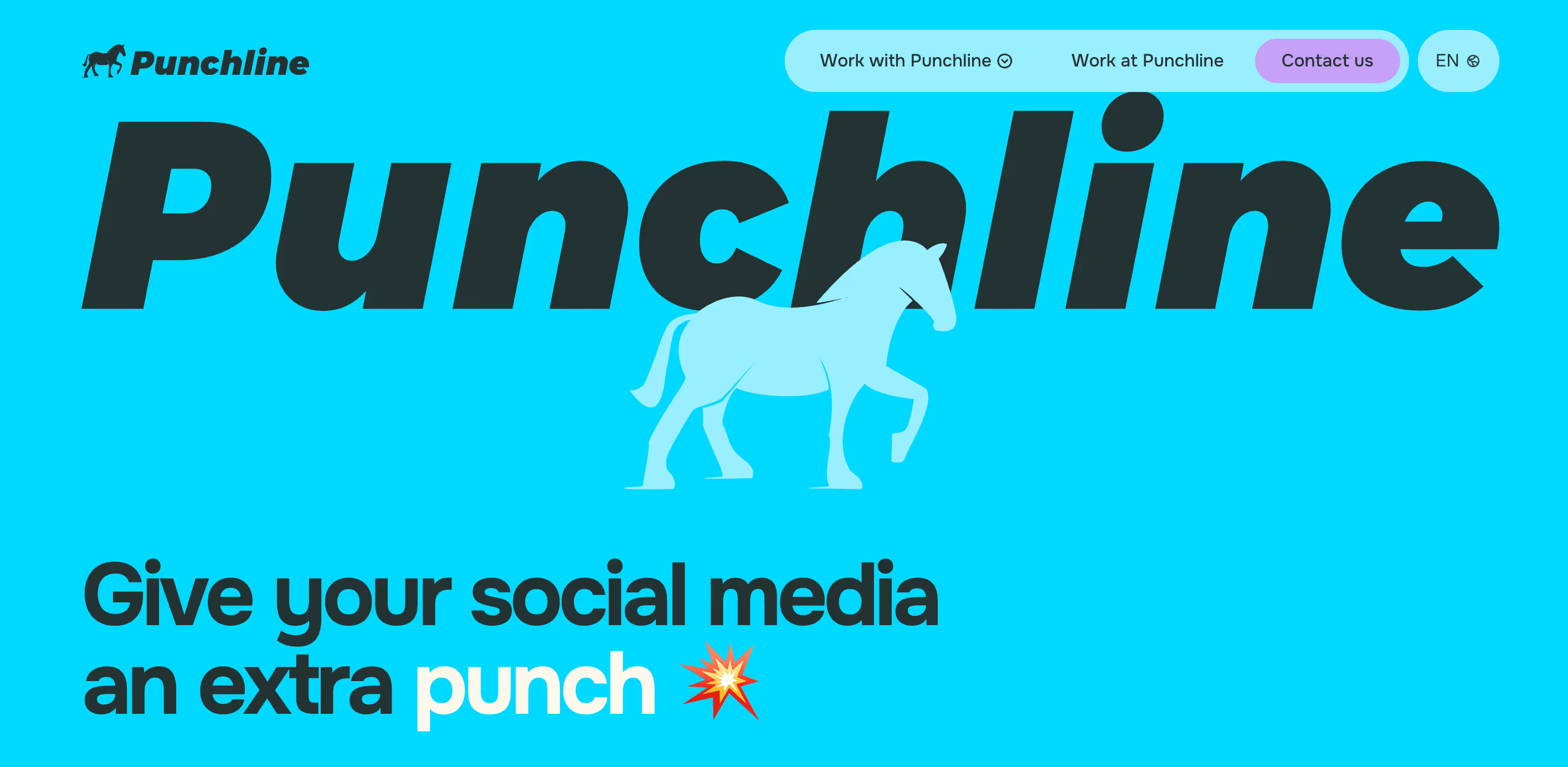
8. Punchline
Punchline’s website is true to its name: sharp, confident, and direct. They use bold typography, fun colours and clean guided layouts to communicate what they do, from the get-go.
What really stands out here is its focus on messaging with its strong visual hierarchy and purposeful design. Learn how to use focussed design principles here.
9. Artisans de Genève
Artisans de Genève’s site feels like pure craftsmanship, where you feel like you are within reach of the product. Rich imagery, refined typography, and elegant transitions speak the brand’s language perfectly.
If you’re looking for luxury storytelling, here’s a beautiful story. What really stands out here is how the UX experience doesn’t feel rushed, it invites you in to observe the details and appreciate the process that goes into making intricate luxury watches.

10. Slush
Slush’s website is bold, full of energy and hands down modern. Dynamic layouts, strong colour contrasts, and playful motion reflect the brand’s avant-garde ethos.
What really stands out here is their energy to experiment with modern design while remaining drawn to its communication. Get inspired right here.

Design Patterns Seen in These Top Webflow Websites
All of the top Webflow websites use:
- Clean, modern UI with strong hierarchy
- Smooth animations & scroll interactions
- Responsive design that feels natural across all screens
- Creative visuals, typography, and navigation
You’ll also see a revival of bold typography and striking color usage to hold the visitor’s attention. The layouts are also segmented grid-wise with a structured and layered visual rhythm where everything feels balanced yet exciting to the eyes.
How to Build a Stunning Webflow Website for Your Brand
Step 1: Start by fixing your layout’s wireframes. Define your website structure and content flow.
Step 2: Choose your typography scale & spacing. Understand the level of whitespace, number of sections to deepen your structure.
Step 3: Now think of adding motion. What kind of motion elements can enhance your messaging.
Step 4: Run responsiveness tests. Design for all screen sizes from the start.
Step 5: Make sure you follow a CTA-driven UX flow. Every page should gently guide users toward what they’re supposed to do.
Common Mistakes to Avoid in Webflow Website Design
1. Overusing animations
Too much motion overwhelms users and distracts from the actual content.
2. Unorganized style naming & CMS structure
Messy font sizes and CMS setups make scaling, updates, and collaboration a painful process later.
3. Non-optimized images slowing load time
Heavy images impact performance, SEO, and first impressions.
4. Poor spacing + inconsistent alignment
Inconsistent spacing breaks visual rhythm and makes layouts feel amateur.
5. Weak navigation UX
If users can’t find what they need quickly, they won’t stick for long.
FAQs
1. What makes a Webflow website great?
A great Webflow site combines clean visual design with a guided structure. Webflow generates clean HTML, CSS, and JavaScript all on its own, ensuring full responsiveness across devices. This gives designers more control over all kinds of layouts without needing to know coding.
2. Is Webflow the Best Website Builder?
Webflow is considered one of the most powerful visual builders as it offers unlimited design freedom, gives clean code output, has a flexible CMS, and strong SEO tools. It is definitely a go-to choice for agencies, brands, and marketers. The definition of best really depends on your goals, budget and design plus technical expertise.
3. How do I learn Webflow quickly?
Webflow University is the perfect place to start. It’s free and very well-structured for all user levels. Combine that by building real pages, exploring cloneable templates, and exploring interactions.
4. Can I build complex animations in Webflow?
100% yes. Webflow’s visual interactions panel lets you build both basic and advanced animations. From scroll-triggered, hover states, 3D transforms to timeline-based sequences. These animations work responsively across devices.
5. Is Webflow good for portfolios and startups?
Absolutely! Webflow’s design flexibility, responsive layouts, and CMS make it ideal for portfolios, startups, and brands of all levels. You can quickly launch an online presence that reflects your brand identity, handle dynamic content (like projects or blog posts), and scale as your business grows.
6. How many pages can you build in Webflow?
You can build up to 150 pages, plus unlimited design elements and CMS content. The exact limit depends on your Webflow plan, but for most businesses and portfolios, this is more than enough to build a full website with blogs, product pages, and landing pages.
7. Do Webflow templates work for professional sites?
Yes they do. Webflow’s official marketplace offers hundreds of professional, responsive templates for portfolios, agencies, e-commerce, and business websites. These templates are built to best practices, fully customizable, and can be tweaked as per your vision.


.svg)

