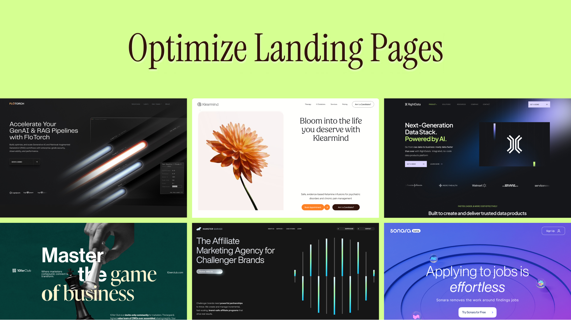
SaaS Landing Page: Best Examples, Layouts & Best Practices
.png)
.avif)
.png)
.png)

.png)
.png)
You’ve seen plenty of websites before, even SaaS ones. Large and bold headlines that sound impressive. Modern and polished design. And catchy colors. But, even after scrolling till the end, you’re left wondering, what is this website all about?
Why does the page leave you guessing?
Something must be amiss. Because that’s something a good SaaS landing page doesn’t do. Instead, it’s clear, focused, and easy to say yes to. It instantly pulls you in.
It makes you nod. Sometimes it even makes you smirk. And before you realize it, you’ve clicked the CTA and handed over your email like it was always part of the plan.
This guide is about those SaaS landing pages and how to build one that actually makes people want to sign up.
What Makes a High-Converting SaaS Landing Page in 2026
A high-converting landing page for SaaS has a primary focus: getting someone to do the thing you want them to do.
Not “learn more."
Not “explore features."
Not “admire our brand story."
It’s one clear conversion goal, which could be to sign up, start a free trial, book a demo, or ask for an email.
Think of your website like a networking event, and the landing page for SaaS is that one-on-one conversation that lasts about a minute, which ends with exchanging business information or drifting away awkwardly.
So, what makes the best SaaS landing page and a high-performing one?
1. Single conversion goal (no wandering)
Most landing pages act like a mini website. They have multiple points of navigation, plenty of links, or a lot of focus on storytelling. So, it’s like, wait, what’s the purpose? What am I supposed to do? What are you telling me?
The idea is to have one page pointed with singular action. Everything else is noise.
2. Clear value proposition above the fold
In 5 seconds, the person who lands on your website must answer, "What does this do for me?" If they can’t, you’ve lost them.
The hero section must capture:
- Who it’s for
- What problem it solves
- Why it’s better right now
Forget flowery language or anything abstract. The clearer, the better.
3. Product-led messaging
In 2026, what works better and is more trustworthy is outcome-led over buzzwords.
Rather than saying, “Revolutionising workflows with intelligent automation”
Say, “Cut onboarding time by 43% without hiring another ops manager."
One sounds more like a pitch deck. The other sounds like you’re getting something that will provide you relief.
4. Optimised for trials, demos, and lead capture
The idea of a SaaS landing page is to start a relationship, not to close the deal.
That’s why the best ones:
- Make trials easy
- Make demos feel low-pressure
- Ask for the minimum information required
Nobody wants to fill out a loan application just to “see how it works."
What works across SaaS models
Whether you’re:
- B2B
- B2C
- Product-led growth
- Enterprise sales
The principle stays the same. You need clarity, momentum, and trust, in that order.
Core Elements of High-Performing SaaS Landing Pages
Most SaaS landing pages don’t fail because they’re missing pieces. It’s because the pieces don’t work together.
There’s intention behind a landing page that works. Every section has a purpose, and every scroll helps the user move closer to a point of decision.
Here’s what actually matters and where teams usually get it wrong.
1. The hero section
Although it’s the beginning of the page, it’s where most pages lose people. The hero section’s job is to instantly help someone understand what this is and why they should care.
What works:
- A headline that explains the outcome, not the category
- A subheadline that adds clarity, not marketing poetry
- A clear next step without pressure
What usually goes wrong
- Vague positioning (“The future of X”)
- Headlines written for investors, not users
- Too many ideas competing for attention
If someone needs to scroll to understand your product, the hero has already failed.
2. The primary CTA
The key idea is not to overwhelm a visitor or ask them to decide how they engage. Instead, guide them toward the right decision. Think more choice = less action.
What works
- One clear primary CTA that matches the buyer’s intent
- CTA language that shows the level of commitment (free signup vs demo)
- The same primary CTA repeated throughout the page, without changing intent
What usually goes wrong
- Multiple CTAs with equal weight, like “Book demo," “Start free," and “Contact sales”
- CTAs that ask for more than the page has earned
- Button copy that says nothing (“Submit”)
With a CTA, the feeling it should bring is like it’s the obvious next step and less like a decision one needs to take.
3. Features vs benefits
From the tool's point of view, features make it sound tangible. For readers, however, it’s more about what changes after they use the product.
Features show what the product has, but benefits tell them why it’s worth their time.
What works
- Leading with the outcome before naming the feature, e.g., “close deals faster” over “automated follow-ups”
- Clearly showing how each capability leads to a real, practical result
- Using everyday language users recognise, instead of internal product or sales jargon
What usually goes wrong
- Long feature lists with no explanation of impact
- Vague benefit statements that can describe almost any SaaS tool
- Technical descriptions that explain how something works but never why it helps
For users the connection of features to value should happen on its own, not be forced.
4. Visual product context
On SaaS landing pages, visuals go beyond decoration and help prove the product does what the words claim. Trust drops if how the products work isn’t visible.
What works
- Showing real product screens in the middle of real workflows, not isolated UI shots
- Using short videos or GIFs that demonstrate value in a few seconds
- Placing visuals exactly where users start asking questions (“How does this work? ”)
What usually goes wrong
- Using abstract illustrations that explain nothing about the actual product
- Dropping screenshots on the page without explaining what the user is seeing
- Adding videos that talk around the product instead of showing it in action
If the main value is the product itself, it doesn’t help to hide behind generic visuals. It simply hurts conversion. The quicker someone understands what they’re looking at, the easier it is to say yes.
5. Social proof & trust signals
More than volume of proof, it’s smarter to have proof at the right place and at the right moment.
Think from the user's view; no one scrolls a SaaS landing page thinking, “Who else uses this?”
They’re thinking, “Will this work for someone like me?”
What works
- Using proof that matches the buyer’s stage (users want results, buyers want credibility)
- Showing specific outcomes, recognisable logos, or concrete use cases
- Adding trust signals that reduce risk, such as security standards, compliance, or guarantees
What usually goes wrong
- Testimonials that sound nice but say nothing meaningful
- Logo walls with no context on how those companies use the product
- Trust elements pushed to the bottom instead of reinforcing key decisions along the page
Don’t use social proof as decoration, it should show up at that exact moment when they’re deciding to move ahead.
Best SaaS Landing Page Examples And What They Do Right
For sure you’ve Googled “best SaaS landing pages,” and you’ve got plenty of links, images, and screenshots. They’re great references, but there’s no universal formula for creating an effective SaaS landing page. Mimicking what works won't give you the results you expect.
A landing page only works because of the business behind it, the buyer type, the pricing model, the sales motion, and certain strategic decisions. There are a few things you must understand.
Let’s look at a few real-life examples to help you recognize better and break down properly why they work.
1. Lowering commitment before asking for it
The idea is to invite people in with a softer entry path rather than leading with “Pick Your Plan." For instance, “Get Started” lowers friction before pushing pricing decisions. It’s not like here, where the prices are upfront and center. It’s soft and subtle, asking users to explore your world and then showing them the price.
This works for products that are
- Quick to experience
- Easy to explore
- Can show value quickly
- Grow from the bottom-up inside organizations
Slack is an excellent example. Their page starts with “Get Started,” an entry flow that invites action before displaying the different forms of subscription.
2. Sell stability not excitement
For SaaS, more than excitement, what converts is reassurance. It’s important to show you are calm, controlled, and corporate. Focus less on flashy animations and dramatic claims. Instead, show credibility, logos, and scale.
Think from an enterprise buyer point of view; they’re not after innovation but rather avoiding risk. The underlying message should be “this is safe," not “this is revolutionary.”
Workday does this well. The landing page prioritizes stability and scale over flash.
3. Anchor messaging in business outcomes
Showcasing features is great; they show what it does. But as buyers, what’s more important is measurable impact. Connecting capabilities directly to results like revenue growth or pipeline acceleration shows what changes.
What HubSpot does well here is that, even when they introduce tools, they frame them in terms of business results.
Since buyers are ROI driven, your content should reflect the same.
Instead of asking, “Does this have the functionality we need?” the page should answer, "Here's what this helps you achieve.” Such framing helps shorten decision cycles.
4. Focus of the page should be on one primary action
If a product is already understood widely, the landing page shouldn’t focus on education. Adding a lot of information will slow people down. If the user already knows the problem, they’re not in the research phase but deciding.
Staying deliberately focused with minimal navigation, one dominant CTA, and clear repetition of that same action throughout the page eliminates choices and what to do next.
So, you’re not keeping it open-ended; you can either explore, compare plans, or talk to sales. The page says to do this. Taking the user from persuasion to activation.
Calendly is a strong example of this. The product is understood and simple. The landing page doesn’t try and sell the idea of scheduling. It guides you toward creating your link.
5. Show the product in action
For products that are interactive or visual, showing it is more effective than describing it. It’s better to see it or feel it than to read what it does.
More than hiding the product behind generic graphics or abstract illustrations, show real product screens early, demonstrate flow with simple motion or animations early, and let the interface do all the explaining.
It’s a way to remove doubt. Without using their imagination, they know how the dashboard looks, where they should click, and how things move. This reduces mental effort, which lowers hesitation.
Check out Figma. While the interface looks decorative, it’s a message. You immediately see collaboration happening, instead of being told about it.
6. Speak to an audience directly
Speaking to everyone at once makes a landing page weak. A strong page does the opposite. It narrows focus by segmenting use cases or roles, adjusts messaging to different audiences, and makes visitors feel like the product was built for them. This way, the message doesn’t need any translation; the intent is to understand instantly. So now the thought isn’t "Is this for me?” it’s "This is clearly for me.”
An excellent example is Webflow. Firstly, they don’t appeal to everyone that needs a website. It speaks clearly to designers, marketers, and teams who care about control. When visitors feel seen, it reduces friction and increases engagement.
7. Break down complexity
One product may be able to a thousand things. Great, but as a founder or someone with close ties to the product, you feel everything is important, useful, and needs to be talked about. That’s not true for the user. Too much can be overwhelming.
It needs to be thought through clearly, like organizing features into clear use cases, guiding visitors through structured paths, or breaking complexity into small understandable pieces. This removes it’s too much feeling.
As Ashok says, “freedom without structure is confusing.”
8. Using price transparency as a strategy for conversion
For some brands, they need to hide the price behind “Book a Demo"; being upfront about it is a way to easily convert users. They show pricing tiers clearly, explain who each plan is designed for, and make comparing features easy to understand. This helps remove any friction and, in one go shows whether the product will fit their budget.
In case you’re wondering why some people don’t show pricing, it’s because complex products come with plenty of features, customization, and intricate details that require a sales call. It’s best to lead with value first and discuss pricing later.
How to Optimize SaaS Landing Pages for Conversions
Okay, you have a live SaaS landing page. Here are a few things you can work on and what to improve for conversion.
Pixeto Pro Tip: Optimisation works best when you change one variable at a time. Don’t redesign the whole page. Adjust, test, measure, repeat.
Final Thoughts: How to Build the Best SaaS Landing Pages
To build the best SaaS landing pages, start by deciding what you want someone to do, then remove everything that doesn’t support that action.
Be clear before being clever.
Be human before being impressive.
And remember, people don’t convert because your SaaS is "innovative." They convert because it feels useful, understandable, and safe to try.
If you’re building or redesigning a SaaS landing page and want it to convert without sounding like everyone else, that’s exactly where Pixeto comes in. Strategy first, personality intact, and zero tolerance for boring.
Because the internet already has enough bland SaaS pages.
Yours doesn’t have to be one of them.
FAQs
1. What makes a good landing page for SaaS?
A good SaaS landing page has clarity. Clarity about what the product does, who it’s for, and what the next step is. It’s not confusing; it focuses on a main action and builds trust. The page is working if someone understands the value quickly and knows exactly what to click.
2. How is a SaaS landing page different from a homepage?
The focus of a landing page is a specific goal, and they are built for a campaign, a feature of an audience. The purpose is not to offer broad information but to drive one action. The homepage introduces the entire brand and its offerings.
3. What are the best SaaS landing page examples?
There isn’t one “best” example. Each one looks different and feels different, but ultimately the goal is communicating value and guiding visitors toward a specific action.
4. How long should a SaaS landing page be?
Length doesn’t matter as long as it answers the relevant questions and builds confidence. Complex products may need more detail beforehand, while simple products need less explanation. So it depends.
5. Are SaaS landing pages good for SEO?
Yes, a SaaS landing page can rank well provided it targets clear keywords and matches search intent. Pages that answer specific problems, load quickly, and use clear structure tend to perform better in search results.
6. What CTA works best on SaaS landing pages?
There’s not one CTA that works best on a SaaS landing page. It depends on a variety of things, like what you sell, who is visiting, and how ready they are.
For a simpler product, “Get Started" may work, but a high-cost product may need “Book a Demo" because buyers want reassurance first. The safest approach is to pick one primary CTA that matches your buying process, then test wording and placement based on real conversion data.
7. How do I optimize SaaS landing pages for conversions?
First, understand where people drop off and why. Gather valuable insights from analytics, heatmaps, and form completion rates to identify potential causes of hesitation. Then start with small changes like making the headline clearer, making the form simpler, or adjusting the placement of the CTA.
It’s advisable to avoid redesigning the entire page at once. Improve one element at a time, measure the impact, and keep what actually brings change in the numbers.


.svg)

