How to Design a Website: A Complete Beginner’s Guide
.avif)
.png)
.png)

.png)
.png)
What you probably want is a way to design one that doesn’t look like “we used a template and hoped for the best.” In 2025, how to design a website really means - how do I build something that loads fast, explains what we do in 5 seconds, works on mobile, and doesn’t make my dev team cry?
You don’t need us to tell you that a website matters. Your analytics already did.
That’s what we’re doing here.
We’ll walk through the actual steps from planning and picking a platform to layout, content, UX, accessibility, and SEO, so you know how to design a professional website easily without guessing, over-designing, or adding 14 sections no one will scroll to. And yes, Ashok would approve.
Quick Summary: Steps to Design a Website
1. Start With Clarity, Not Colours
2. Build the Skeleton Before the Skin
3. Choose the Right Platform, Not Just the Familiar One
4. Design For Emotion and Ease
5. Let Content Lead Design
6. Make Mobile Your Main Stage
7. Optimise For Visibility and Performance
8. Test, and Tweak, Like You Mean It
9. Keep It Alive
Why Website Design Matters in 2025
Before we get into how to design a website, it’s worth understanding why design itself has become a business strategy in 2025.
Today, when you think of how to design a website easily, it’s not about adding sections or picking a nice font. It’s about building something people believe in.
Your site has become your digital body language - the space where design, speed, and clarity quietly say, “You can trust us.
Most people don’t analyse design consciously, but they judge it instantly.
- The way your homepage loads
- How your menu unfolds
- How your copy aligns with your visuals
Every micro-interaction shapes whether someone stays or leaves. That’s why, today, website design is less about how it looks and more about how it feels.
A great website doesn’t just represent your business, it reflects how you think.
- Its clarity shows how you communicate
- Its layout shows how you organise
- Its polish shows how seriously you take your work
A confusing or outdated design sends a message that the business behind it might operate the same way. A fast, well-structured, mobile-responsive site says the opposite: we’re reliable, relevant, and ready for you.
Think of Apple’s website. You don’t read it, you breathe it. White space, typography, and pacing create calm authority. You feel the product’s precision before a single line of copy convinces you.
Then look at Notion. It’s minimal, modular, yet full of personality. Its design doesn’t just reflect its product, it is the product’s philosophy: organised, flexible, creative. And that’s exactly what good design does, mirrors the brand’s behaviour.
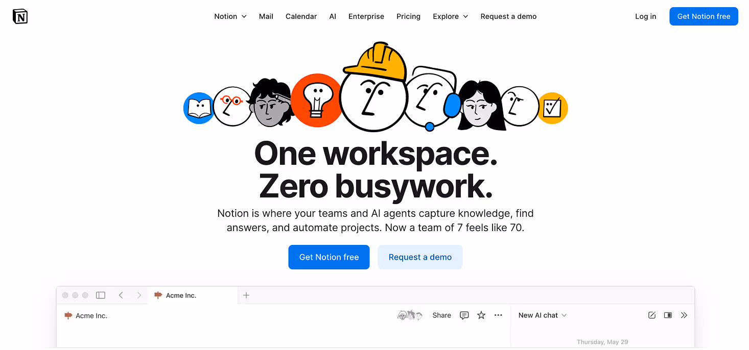
Source: https://www.notion.com/
Good design has become a trust currency.
It tells your audience they’re in safe hands.
Even before anyone reads a single word of your content, the layout, colour system, and flow have already made a statement, one that either builds credibility or costs it.
When you think about how to design a website easily, it’s not just about how your site looks, it’s about how fast it responds.
In the “Milliseconds Make Millions” study by Deloitte and Google, a tiny 0.1-second improvement in mobile speed led to up to 8% more conversions in retail and 10% in travel.
The takeaway?
Faster doesn’t just feel better. It performs better.
Google’s own user performance data backs this up. Even a fraction of a second in load time can shift how people focus, click, and interact. Those milliseconds are often the difference between curiosity and conversion.
.avif)
A strong design doesn’t just please people, it helps algorithms understand you.
Google now ranks experiences, not keywords.
A clear structure, intuitive wireframes, and well-planned content signal that your site knows its audience. And in return, your audience feels like your site knows them.
Accessibility is part of that story too. It’s no longer a box to tick, it’s a reflection of your brand’s empathy.
When your website is easy for everyone to read, navigate, and use including people with visual or motor challenges, it shows that you care about experience, not just design. It tells visitors, “We thought about you.”
Microsoft is a great example of this.
Its Inclusive Design Toolkit encourages teams to design with empathy, creating products that work better for everyone.
So when we talk about how to design a website easily in 2025, we’re really asking something bigger:
How do you design a site that earns trust fast, works beautifully across devices, tells your story with clarity and actually helps your business grow?
Because in today’s digital economy, design isn’t decoration anymore.
It’s proof that your business deserves a place on someone’s shortlist.
How to Design a Website That Works, Not Just Looks Good
How to design a website easily in 2025 isn’t about ticking boxes on a to-do list. It’s a sequence of small, smart decisions that, together, build something that feels effortless to use and impossible to forget.
Let’s break it down for you step by step and understand how to design a website easily without overcomplicating it.
1. Start With Clarity, Not Colours
Before opening Figma or choosing a template, start by asking the one question most people skip,
“Who is this really for?” Getting this step right is half the work in mastering how to design a website that connects on the first scroll.
Your target audience shapes everything like tone, visuals, layout, even button labels. A portfolio site for a creative agency should feel expressive and fast while a healthcare product site should feel calm and structured. Get that clarity first, and every design choice later becomes obvious.
Pro tip: Don’t call this the “design phase.” Call it translation. You’re translating what your brand stands for into a visual experience people can instantly recognise.
That’s the first secret to understanding how to design a website that truly connects.
Try this: Spend 15 minutes studying your competitors’ homepages. Notice how each one feels. If you can’t tell who they’re talking to, they probably don’t know either, and that’s where you’ll win.
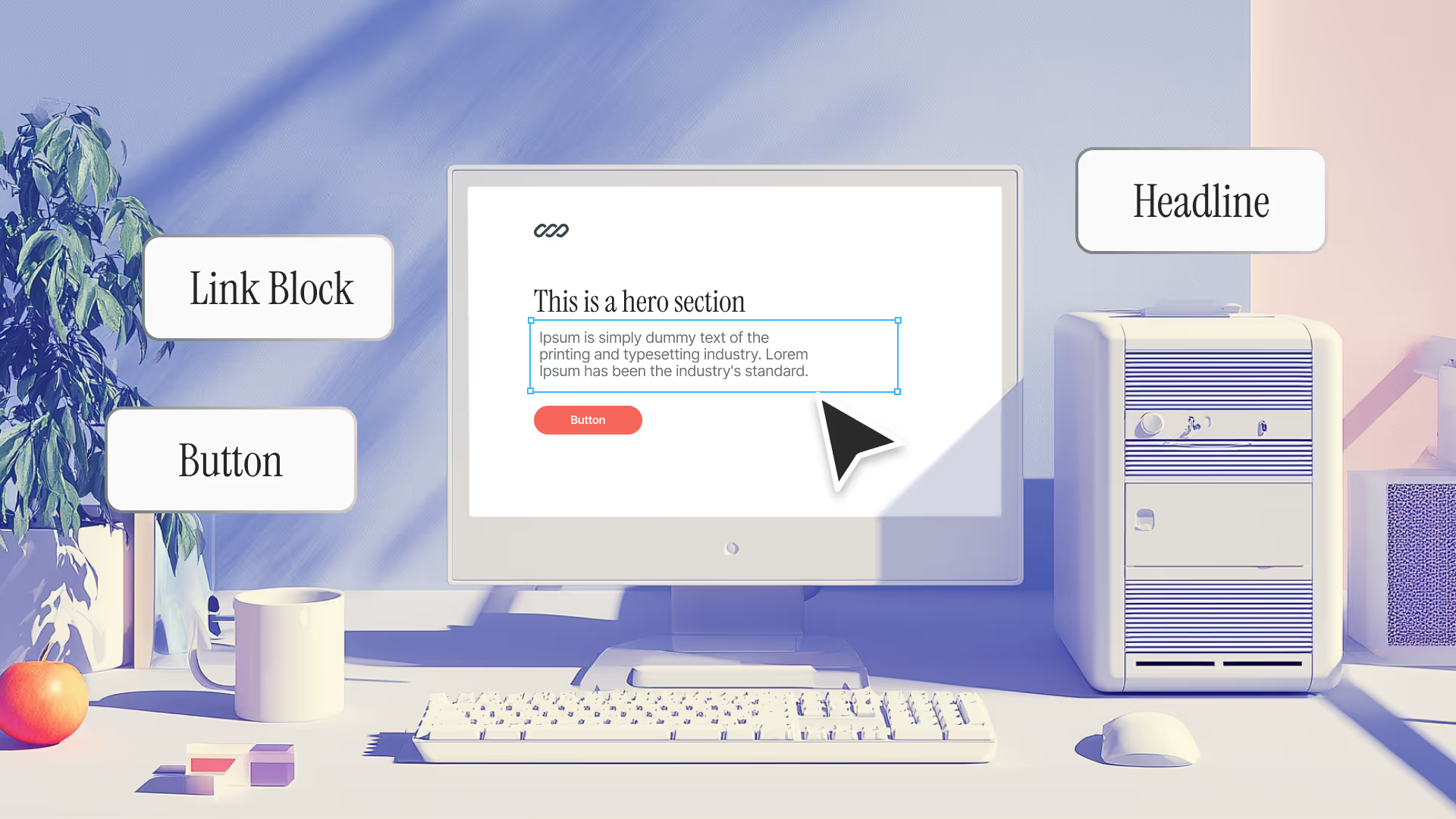
2. Build the Skeleton Before the Skin
This is next in how to design a website and where your site structure and wireframes come in. Think of them as your blueprint. They show how pages connect, how information flows, and how users move from curiosity to action.
Start simple: Home → About → Services → Proof → Contact.
Then layer in logic.
Where should case studies live? What happens after someone clicks “Book a demo”?
Tools like Whimsical, Figma, or Miro make it easy to map this visually before you touch a single pixel. Once the structure makes sense, the design will too.
Learn from Apple. Its Human Interface Guidelines emphasise clarity, consistency, and thoughtful user flow, which are principles that shape every experience across its platforms. You don’t need Apple’s budget, but you can borrow its discipline. Map the path before you paint the walls.
3. Choose the Right Platform, Not Just the Familiar One
Picking your platform or CMS isn’t about what’s popular; it’s about what performs best for your goals.
- If you’re a designer building for speed and control, Webflow gives you power without plugins.
- If you need blog-heavy content management, WordPress still rules.
- If you want drag-and-drop simplicity for small teams, Squarespace or Framer might be perfect.
The right foundation sets you up for growth. Choose a platform that scales as your site and business evolve, a critical step when learning how to design a website easily for long-term success.
If you’re unsure: Ask this - do you want freedom or familiarity? Freedom means customisation (Webflow), and familiarity means community and templates (WordPress). There’s no wrong choice, just the right fit for your workflow.
4. Design For Emotion and Ease
If you’re serious about learning how to design a website that builds trust through feeling, not flash, this is where it happens. Once the structure and platform are set, now comes the fun part comes, the layout. But layout isn’t decoration, it’s choreography.
Where your hero section sits, how whitespace breathes, or how a headline pairs with a button, these choices quietly decide whether your brand feels calm and confident or cluttered and confusing.
Good design has rhythm. It leads the eye, builds emotion, and helps people move through your page without friction. Use visual hierarchy to guide them:
- One clear message per section
- Strong contrast to draw attention
- Consistent spacing to keep balance
Design the page the way a good host guides a guest - confidently, without overexplaining. This is the heart of UX. How your design feels, not just how it looks.
See it in action: Visit Airbnb’s homepage. Notice how it feels instantly calm and easy to trust. The white space gives the page breathing room, the images are bright but natural, and every card follows the same rhythm with photo, title, price, and rating. No clutter, no overwhelm. Nothing about it feels forced. It’s calm, deliberate, and that’s exactly why you trust it.
.avif)
Source: https://www.airbnb.co.in/
5. Let Content Lead Design
Many people skip this when figuring out how to design a website easily, but the truth is, strong content makes design effortless. Funnily enough, even the best layout fails if the content strategy is weak. Your words, visuals, and structure need to move together like choreography, not separate acts.
Start with clarity. Write headlines that sound human, not heavy. Use visuals that add meaning, not decoration. Pair short sentences with scannable points. People might not read every word, but they always notice flow.
If design is your structure, content is the current that moves people through it. That’s why every great guide on how to design a website begins and ends with content clarity.
Quick test to ask yourself - Could a first-time visitor understand who you are and what you offer in the first few seconds of landing on your homepage? If not, the design might be fine, but the message isn’t. As Ashok rightly points out, clarity beats cleverness every time.
6. Make Mobile Your Main Stage
In 2025, mobile responsiveness isn’t a checkpoint. It’s the starting point. Most people will meet your brand on a phone long before they ever open a laptop. It’s now central to how to design a website that performs in real life.
That means your menu, typography, and buttons can’t just shrink. They need to adapt. If a thumb can’t reach your call to action or a headline wraps awkwardly, you’ll lose attention in seconds.
Design for touch, not clicks. Test layouts on real devices, not browser previews. Every small choice, thumb reach, font size, image scale, and load speed adds up to smoother journeys and faster decisions.
If it feels good on mobile, it will feel even better on desktop.
Quick test: Open your site on your phone and hand it to someone else. Don’t say a word. Watch where they tap, hesitate, or scroll. That is the most honest usability test you’ll ever run
7. Optimise For Visibility and Performance
Now comes search engine optimization (SEO), the technical soul of your design. This technical layer is where many get stuck when exploring how to design a website easily. SEO today is not about cramming in keywords or chasing algorithms. It’s about creating a website that both people and search engines understand easily.
Good SEO starts with clarity. Clean code, fast load times, and logical headings help Google and your visitors move through your site without friction. A strong site structure tells search engines what matters most, while intuitive navigation tells users the same thing.
Remember that Google now rewards experiences that feel natural. It looks at how quickly a page loads, how well it adapts on mobile, and how easily people find what they need. The smoother the experience, the higher your chances of visibility.
Keep checking how visitors behave. Use analytics to see where they drop off and where they engage. Compress your images, clean up scripts, and test your site’s speed often. Every small improvement adds up to faster decisions and better trust.
A fast, structured site doesn’t just rank higher. It feels more confident to use.
Quick test: Run your site through PageSpeed Insights. If your score is below 80, you’re leaving traffic and trust on the table.
8. Test, and Tweak, Like You Mean It
Before launch, slow down and look at your website the way a visitor would, not the way you built it. Click every button. Submit every form. Try it on a phone, a tablet, or even an old laptop. If something feels off, fix it. Good design isn’t only about how it looks. It’s about how it works.
Pro Pixeto Tip: Hand the site to people who weren’t part of the project, like a friend, a client, or someone in another department. Watch where they hesitate or get confused. Those small pauses show where your user experience still needs work.
When everything finally flows, go live. That’s the moment you realize that how to design a website easily was never about shortcuts. It was about designing with intent.
And once you’re live, keep learning. Iteration is a huge part of designing a **website that keeps improving with every visitor.
Even the most successful digital brands test and iterate constantly. Netflix, for instance, has built its entire product innovation around real-world experimentation (Netflix research). Through continuous A/B testing, they use member behaviour clicks, watch patterns, and interface interactions to decide what actually works. Every improvement, from recommendations and thumbnails to layout and content flow, is data-backed, not opinion-driven.
“Experimentation provides the framework to ensure that data, not opinion, is used to make decisions on the innovative ideas that we propose,” says the Netflix product team.
Watch the full explanation here: Netflix – The Science of Experimentation
9. Keep It Alive
A website isn’t a one-time project; it’s a living, evolving part of your brand. It grows, adapts, and sometimes even outgrows the purpose it started with. That’s why great design doesn’t end at launch; it begins there. And that’s the real secret behind how to design a website easily for long-term growth.
Every month, look at how people actually use your site, where they click, where they stop, and what they ignore. Those patterns tell you what’s resonating and what’s not. Update your visuals, refresh copy, test new layouts, and let real behaviour guide the next version.
The best brands don’t rebuild from scratch every year. They refine continuously. Think of how Airbnb has evolved its website over time. Cleaner visuals, simplified navigation, and storytelling that now focus entirely on belonging and experiences. Each redesign builds on user data and business direction, never vanity.
That’s what sustainable design looks like - small, meaningful iterations that keep your site relevant without losing its core identity. When you treat your website as a product, not a project, it stays modern, adaptable, and true to your audience.
In short, mastering how to design a website in 2025 means seeing design as an ecosystem, one where layout, UX, accessibility, and SEO work together. When it’s done right, the experience doesn’t just look professional, it feels inevitable.
How Pixeto Can Help
Most businesses don’t struggle to build a website. They struggle to build one that works. One that converts. One that actually feels like them.
If you’ve been trying to figure out how to design a website that feels authentic and converts visitors, that’s exactly where Pixeto comes in.
We design for outcomes like trust, memorability, and conversions. When a website underperforms, the problem usually isn’t colour or typography. It’s the story, the structure, or the flow. We fix that by aligning every design decision with what your users need and what your business wants to achieve.
Our process is simple but sharp. We start by understanding your audience and uncovering what’s stopping them from acting. It could be unclear messaging, weak hierarchy, or an outdated interface. Then we redesign the experience, so visitors move from interest to inquiry without friction.
For one SaaS client, that mean't creating a interactive product demo on website hero section. Demo requests went up by 40 percent.
For a Wellness clinic, it meant using design to show empathy and warmth. Appointments booked increased by 2x.
That’s what we do. We remove the noise, keep what matters, and design systems that make your brand easier to trust.
Our expertise sits where strategy meets creativity, at the intersection of brand, design, and behaviour. We understand how buyers think, how they scroll, and what makes them act. That’s why our work doesn’t just look clean. It feels right.
When it comes to designing a website, we specialise in:
- Brand Refresh - turning existing brand into a new vision with freshness.
- Research, Positioning and Content - creating strong foundation for website success.
- Web Design - complete UI/UX design based on data.
- High-performance Webflow development - fast, scalable builds your team can manage easily
Everything happens in-house across strategy, content, design, and build, so you never lose alignment or speed between stages. And unlike most agencies, we don’t stop at handover. We stay with you, refining, testing, and evolving your website as your business grows. A website isn’t a campaign. It’s a living product.
If your site looks good but doesn’t convert, loads fine but doesn’t communicate, or attracts visitors who never stay, we can help you change that.
Pixeto builds websites that make sense, make money, and make your brand impossible to ignore.
Start your project → Book a free clarity call
FAQs
1. How long does it take to design a website?
Ans: It depends on scope and clarity. A small business site can take 3-4 weeks if content and branding are ready, while more complex builds like SaaS or eCommerce may take 8–10 weeks. The biggest factor isn’t design time, it’s decision time. Faster feedback means faster launch.
2. Do I need to know coding to design a website?
Ans: Not necessarily. Tools like Webflow let you design visually without writing a line of code. But understanding how code works helps you think structurally; you’ll make cleaner layouts and smarter design choices.
3. Which platform is best for beginners?
If you’re just starting out, Webflow is ideal for control and speed. WordPress works well for blogs or content-heavy sites, while Squarespace and Wix are great if you want simplicity and templates that just work. The “best” one depends on your goals, not your skill level.
4. What are the best tools for website design and optimization?
For design and wireframing, use Figma or Adobe XD. For building, Webflow and Framer are the top choices. To optimise performance, tools like Google PageSpeed Insights, Hotjar, and Ahrefs help you test speed, track user behaviour, and fine-tune SEO.
5. Can a beginner design a website?
Absolutely. With platforms like Webflow and Canva, anyone can start learning how to design a website easily. The key is to focus on purpose, not polish. Start small, test often, and improve as you go. Every great designer began by experimenting.
6. Can ChatGPT design a website?
ChatGPT can’t build a website visually, but it can guide you through structure, layout ideas, and even help you write your content strategy or SEO plan. Combine it with a design tool like Figma or Webflow, and you can go from concept to launch much faster.


.svg)

