Mobile-First Web Design: Complete Guide for Better UX & SEO

.avif)
.png)
.png)

.png)
.png)
.svg)
Mobile-first web design is an approach where websites are designed primarily for mobile devices before being adapted for tablets and desktops. If your site still starts from a desktop layout and squeezes down, you are working against how Google ranks and how most of your users actually browse.
Over 59.6% of all global web traffic now comes from mobile. Google indexes and ranks your site based entirely on its mobile version. Most legacy websites were still built desktop-first. That gap is your competitive edge.
What does what is mobile first web design mean for your SEO? How does it differ from responsive design? What does correct implementation look like? This guide answers all three.
Quick Answer — What is mobile-first web design?
- Definition: A design approach that builds for the smallest screen first, then scales up to tablets and desktops
- Core difference from responsive: Mobile-first starts small and expands; responsive adapts any layout to any screen
- SEO impact: Google's mobile-first indexing ranks sites based entirely on their mobile version
- Performance target: LCP under 2.5 seconds, pass Core Web Vitals on mobile
- Bottom line: Better rankings, lower bounce rates, and higher mobile conversions
Key Stats
- Mobile traffic: 59.6% of all global web traffic comes from mobile — Mobiloud
- Conversions: A 1-second delay in load time reduces conversions by 7% — web.dev
- Mobile shopping: 68% of online orders placed via smartphones; 77% of retail web traffic is mobile
What Is Mobile-First Web Design?
Mobile-first web design is an approach where websites are designed primarily for mobile devices before being adapted for tablets and desktops.
Definition: Mobile-first web design means building every layout, navigation, and content decision around the smallest viewport first, then progressively enhancing for larger screens — the direct opposite of traditional desktop-first development.
Instead of building a rich desktop site and stripping it down for phones, you build a lean, focused mobile experience first. Everything added for larger screens is a deliberate enhancement, not a default.
How mobile-first design works in practice:
- You open your design tool at 375px — the standard phone viewport
- All core content, navigation, and CTAs are designed and validated at this size
- CSS media queries using add layout complexity as the viewport grows
- Desktop layouts receive the full version only after mobile is validated
Traditional vs mobile-first: a direct comparison
Why your mobile screen comes first:
More than half your visitors are on a phone. In Africa and Asia, mobile's share of web traffic exceeds 72–79%. Mobile-first indexing from Google means your mobile version determines your search rankings, not your desktop version.
Industries that benefit most from a mobile-first strategy:
- E-commerce (68% of orders placed on mobile)
- News and media
- Healthcare and appointment booking
- Hospitality and travel
- Financial services and fintech
The relationship between user experience (UX), SEO, and mobile performance is direct: a poor mobile experience increases bounce rates, which signals low quality to Google, which damages your rankings. All three are the same problem.
Why Mobile-First Web Design Matters in 2026
Businesses that built mobile-first years ago are holding positions your desktop-first site is struggling to reach. Here's why the gap keeps widening.
1. Global mobile usage has passed the point of no return:
Mobile devices accounted for 59.6% of global web traffic in 2025. In India, that figure exceeds 80%. If your market includes emerging economies or younger demographics, a mobile-first strategy is not a preference — it's a prerequisite.
2. Google's mobile-first indexing changed the ranking equation:
Google completed its rollout of mobile-first indexing for 100% of websites. Your mobile version is now the primary input for Google's crawl and ranking decisions. A slow or broken mobile experience hurts rankings even when your desktop version is flawless.
3. User expectations on mobile are ruthless:
A 1-second delay in page response reduces conversions by 7%. Google research shows 53% of mobile users abandon sites that take longer than 3 seconds to load. You have a narrow window to impress — and mobile users close it faster than desktop users do.
4. Mobile commerce is driving real revenue:
77% of retail website visits happen on mobile. 68% of online shopping orders are placed via smartphone. A mobile-centric design approach is now directly tied to your bottom line, not just your rankings.
5. Your competitive edge:
Most legacy sites were built desktop-first. A full mobile-first redesign gives you a structural SEO and UX advantage over every competitor who hasn't made that switch.
Mobile First vs Responsive Web Design: What's the Difference?
Although mobile first and responsive web design are closely related, they are not exactly the same. Mobile-first focuses on designing for smaller screens first, while responsive web design adapts layouts across all devices.
Here's where most teams get confused: every mobile-first site is responsive, but not every responsive site is mobile-first.
What is responsive web design?
Responsive web design is a technical approach where a site's layout fluidly adjusts to fit any viewport. It uses flexible grids, responsive layouts, and CSS media queries to reformat content automatically. The design can start from desktop or mobile — responsive just means it doesn't break at different sizes.
The key distinction in mobile first vs responsive web design:
Best for mobile-first: E-commerce, content sites, marketing pages — anywhere SEO or mobile conversions drive the business
Best for responsive (desktop-first): SaaS dashboards, developer tools, data-heavy internal platforms with primarily desktop audiences
Common misconceptions about mobile first and responsive web design:
- "They're the same thing." A responsive site built desktop-first still loads full desktop assets on a phone.
- "Mobile-first means desktop suffers." Wrong. You enhance upward, so desktop users get the full layout.
- "You have to choose one." You don't. Mobile first responsive web design is the gold standard: start at the smallest screen, respond upward.
When to use each:
Use mobile-first when your analytics show over 50% mobile traffic or when SEO rankings are a primary goal. Use responsive-without-mobile-first for complex desktop products where most real sessions happen on large screens.
Original Insight: Your CSS Reveals Your Real Approach
Whether you use in your media queries tells the real story. Mobile-first developers write — start mobile, add complexity. Desktop-first developers write — start desktop, remove it. Your codebase doesn't need to claim mobile-first. It either is or it isn't.
Bottom line: Mobile-first responsive web design is the gold standard. Start with the phone, scale to the screen, and let responsive techniques handle the breakpoints in between.
Watch: Is Mobile-First Design Still Relevant in 2025? — YouTube
Key Benefits of Mobile-First Web Design
Switching to a mobile-first strategy is one of the highest-ROI changes you can make to an existing website. Here is what you gain.
1. Better Mobile User Experience
Designing for the smallest screen forces ruthless prioritization. You keep only what matters, producing a cleaner and more focused experience for the majority of your visitors.
Nielsen Norman Group research shows that mobile UX failures are most often caused by desktop-first designs poorly adapted for small screens — not by mobile being a difficult medium.
2. Improved Page Speed
Starting mobile-first means loading only what's essential. Images are optimized, scripts are minimal, and the critical rendering path is shorter from the start. This directly improves your Core Web Vitals scores and reduces Time to Interactive.
3. Higher Search Engine Rankings
Google's mobile-first indexing means your mobile page quality is your SEO quality. There is no separation. A well-optimized mobile version translates directly to stronger rankings.
4. Lower Bounce Rates and Better Engagement
Fast, well-structured mobile pages keep visitors on your site longer. Lower bounce rates and higher dwell time are positive engagement signals that reinforce your rankings over time.
5. Better Accessibility and Mobile Usability
Touch-friendly principles — larger tap targets, clear spacing, thumb-reachable CTAs — make your site more accessible to a broader audience, including users with motor impairments.
6. Improved Conversion Rates
A 1-second improvement in mobile load time can increase conversions by up to 7%. On e-commerce sites, that difference is directly measurable in revenue.
7. Simplified, Cleaner Layouts
The constraint of a small screen is a feature. It forces design clarity and removes clutter that was never serving users anyway. Those improvements carry forward to every other breakpoint.
8. Future-Proof Development
Wearables, foldables, and in-car screens are all becoming standard. Designing for constrained viewports first means your layouts adapt to whatever screen comes next without a full rebuild.
How Mobile-First Web Design Improves SEO
Mobile-first design and SEO are the same strategy in 2026, not parallel tracks.
Google's mobile-first indexing explained:
Google uses the mobile version of your site as the primary input for indexing and ranking. If your mobile version is missing content visible on desktop, loads slowly, or fails mobile usability checks, your rankings drop. (Google Search Central documentation)
Core Web Vitals are mobile performance signals:
Google measures three Core Web Vitals as confirmed ranking factors:
- LCP (Largest Contentful Paint): Under 2.5 seconds
- INP (Interaction to Next Paint): Under 200ms
- CLS (Cumulative Layout Shift): Under 0.1
All three are measured on mobile. Google's Web Vitals documentation confirms these are direct ranking inputs. A mobile-first build naturally improves all three by starting lean.
Real-world proof:
Pinterest switched to a mobile-first performance strategy and reduced perceived wait times by 40%, resulting in a 15% increase in organic search traffic and a 15% increase in sign-ups. (Pinterest Engineering Blog)
That's not coincidence. Faster mobile experiences improve the engagement signals that search engines use to rank content.
Page speed on mobile directly impacts your position:
Google's PageSpeed Insights scores mobile and desktop separately. A mobile-first build typically scores higher on the mobile audit because it doesn't carry desktop-weight assets to smaller screens.
Structured content for mobile readers is also good SEO:
Short paragraphs, clear headings, and scannable bullet points improve mobile readability and help Google understand your content hierarchy. They also improve your chances of being extracted into featured snippets and AI Overviews.
SEO best practices for mobile-first websites:
- Use descriptive, keyword-rich alt text on all images
- Keep canonical tags consistent across mobile and desktop
- Avoid separate mobile subdomains (m.site.com) — use responsive URLs
- Test with Google's Mobile-Friendly Test
- Monitor Core Web Vitals for mobile in Google Search Console weekly
Bottom line: Your mobile UX is your SEO. Google measures the same performance metrics — LCP, INP, CLS — that determine whether users stay or leave. Build for mobile first and both improve simultaneously.
Essential Principles of Mobile-First Responsive Web Design
Understanding the principles behind mobile-first responsive web design helps you implement it correctly, not just technically.
1. Design for Smaller Screens First
Open your design tool and set the artboard to 375px. Every content, navigation, and CTA decision should work at this size before you think about anything larger. This single constraint changes everything downstream.
2. Prioritize Content Hierarchy
What does the user absolutely need on a small screen? Lead with that. Everything else is secondary. This discipline produces cleaner designs at every breakpoint.
3. Use Flexible Grids and Responsive Layouts
Use CSS Flexbox or Grid with percentage-based widths rather than fixed pixel values. Your layouts should reflow naturally as viewport width increases, requiring minimal override rules.
4. Apply Touch-Friendly Design Principles
Google recommends a minimum tap target size of 48x48 pixels with 8px spacing between targets. Buttons that are too small or too close together are among the top mobile usability failures in the wild.
5. Set Readable Typography
Use a minimum of 16px for body text. Keep line lengths between 45 and 75 characters. Anything smaller forces pinch-zooming, which is a UX failure that directly increases your bounce rate.
6. Optimize Images and Media
Use responsive images with attributes. Serve WebP format where supported. Never load a 1400px image on a 375px screen — this single fix can cut page weight by 50% or more.
7. Write CSS media queries the Mobile-First Way
Write mobile styles as your base, then use min-width breakpoints to enhance upward. (MDN CSS Media Queries Guide)
8. Build Accessibility In from Day One
Design with sufficient color contrast, large tap targets, and screen reader compatibility from the start. Accessibility and mobile UX optimization share the same principles — solving for one improves the other automatically.
Watch: CSS Media Queries for Beginners (Mobile First) — YouTube
Best Practices for Mobile-First Web Design
Here is what your mobile-first build actually needs to get right.
1. Keep Layouts Simple and Uncluttered
One column is almost always correct for mobile. Resist replicating desktop complexity at smaller sizes. If your mobile layout requires explanation, it needs simplification.
2. Optimize Page Speed from Day One
Compress all images before upload. Defer non-critical JavaScript. Use a CDN. Remove unused CSS. These steps alone can cut load times by 40–60% before you've changed a single design element.
3. Use Responsive Images and Lazy Loading
Add loading="lazy" to below-fold images. Use to serve appropriately sized images per viewport. This reduces initial page weight without compromising visual quality on any device.
4. Avoid Intrusive Popups on Mobile
Google penalizes sites with intrusive interstitials on mobile. Use a bottom sheet or inline form instead of full-screen popups. This is both a user experience issue and a direct ranking liability.
5. Minimize Third-Party Scripts
Every third-party script adds load time. Audit your tag manager and remove anything not actively contributing to conversions or measurement. Your Core Web Vitals scores will reflect every script you cut.
6. Improve Mobile Navigation Menus
Use hamburger menus or bottom navigation bars. Keep menu items to five to seven maximum. Ensure navigation is keyboard-accessible and works with screen readers.
7. Test Across Multiple Real Devices
Don't rely only on Chrome DevTools' device simulator. Test on real Android and iOS devices across different screen sizes. Real devices surface rendering issues simulators consistently miss.
8. Monitor Mobile Usability Metrics Continuously
Check Google Search Console's Mobile Usability report weekly. Track Core Web Vitals for mobile specifically. Use Hotjar or Microsoft Clarity to watch real mobile session recordings.
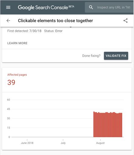
Alt text: "Google Search Console mobile usability report for a mobile-first web design"
Common Mobile-First Web Design Mistakes to Avoid
Even experienced teams make these errors. Knowing them saves weeks of re-work.
1. Designing Desktop-First and Shrinking Later
This is the most common mistake. You end up stripping features rather than building intentionally. The result is a mobile experience that feels like an afterthought — because it was.
2. Ignoring Page Speed Until After Launch
A beautiful mobile design that loads in 8 seconds is useless. Page speed optimization must be part of the build process, not a post-launch fix. Slow architecture is expensive to unpick once shipped.
3. Poor Touch Target Sizing
Buttons under 44px, links too close together, and small form fields frustrate users and spike bounce rates. Apple's Human Interface Guidelines recommend minimum 44x44pt touch targets. Get this wrong and your analytics will tell you quickly.
4. Overloading Mobile Pages with Content
More content is not better on mobile. Every piece that doesn't serve the user's core intent should be removed or deferred — not scaled down. Constraint produces clarity.
5. Using Unreadable Font Sizes
Body text smaller than 16px forces users to zoom. Headings below 20px look weak on Retina displays. Set your type scale at 375px and verify it on a physical device before sign-off.
6. Hiding Content That Google Needs to Index
Hiding key content on mobile "to keep it clean" is a direct mobile indexing problem. Google's mobile-first indexing documentation confirms that content hidden on mobile loses ranking authority, even if visible on desktop.
7. Skipping Cross-Device Testing
Testing only on your own device leaves serious gaps. Use BrowserStack to test across thousands of real device and browser combinations before you go live.
8. Ignoring Accessibility Standards
Nielsen Norman Group consistently shows that mobile usability failures are rarely about screen size — they are design decisions that were never tested with real users on real devices.
Best Tools for Creating Mobile-First Websites
Your toolset should support mobile-first adaptive design natively, not as an afterthought.
1. Design and Prototyping
Figma — Industry standard for mobile-first UX design. Set artboards to 375px and use auto-layout for components that flex across breakpoints.
Adobe XD — Strong for responsive prototyping with shared component libraries across screen sizes.
Sketch — Good for Mac-based teams; symbol libraries work well for mobile-first component systems.
2. CSS Frameworks
All three of the following treat mobile-first as their default, not an option:
3. Performance Testing
Google PageSpeed Insights — Scores mobile and desktop separately. Free, and results correlate directly with ranking signals.
Lighthouse (Chrome DevTools) — Instant audit covering performance, accessibility, and SEO. (Lighthouse documentation)
GTmetrix — Detailed waterfall analysis for identifying slow-loading resources.
4. Core Web Vitals and SEO Tools
Google Search Console — Core Web Vitals report and Mobile Usability report side by side. Your first stop for any mobile SEO issue.
web.dev/measure — Google's own real-world Core Web Vitals measurement tool.
5. Mobile Usability Testing
BrowserStack — Cross-device testing on 3,000+ real mobile devices and browsers.
Hotjar — Heatmaps and session recordings showing real mobile user behavior.
UserTesting — Remote usability studies with real users completing real tasks on mobile.
6. CMS Platforms
Webflow — Visual builder with mobile-first breakpoints and strong responsive layout support. For teams considering Webflow, Pixeto's guide to Webflow performance optimization covers how to maintain high mobile performance scores in production.
Next.js + Headless CMS — Best for high-performance, custom mobile-first builds where developers control every render decision.
WordPress + Gutenberg — Widely used with good mobile preview tools built into the block editor.
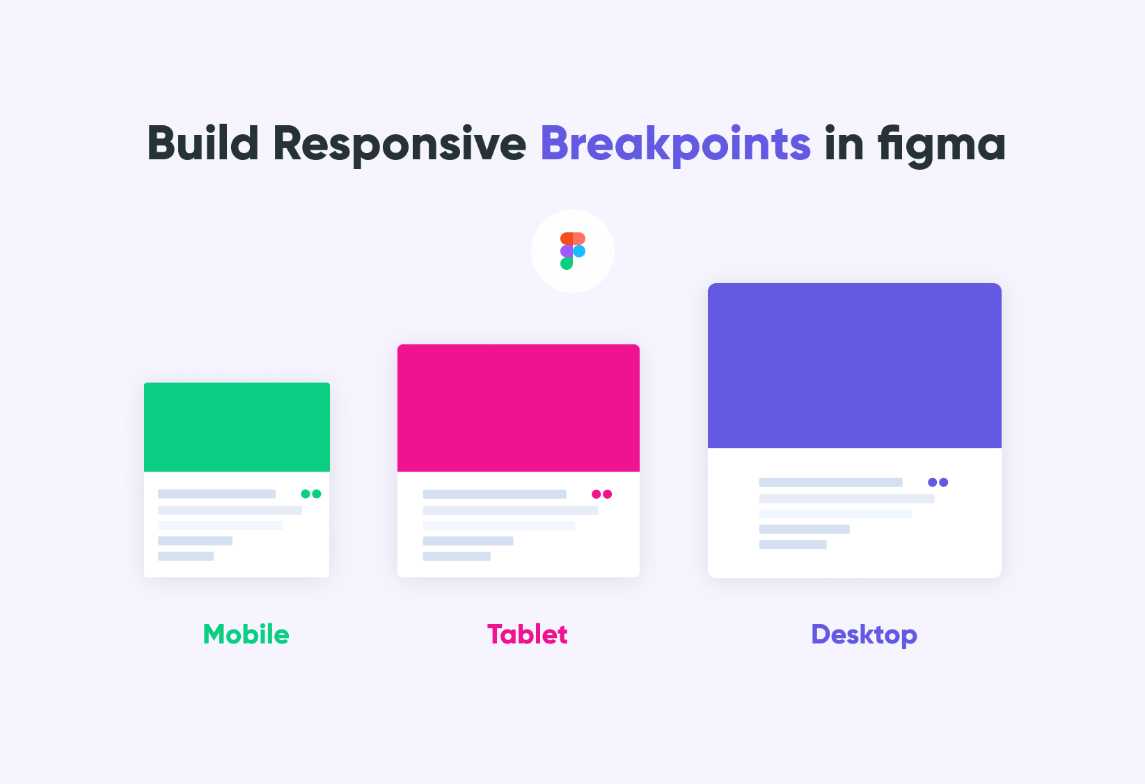
Alt text: "Figma mobile-first web design tool with responsive layout artboards at 375px and 768px"
Key Takeaways
- Mobile-first web design means designing for the smallest screen first, then scaling up — not the reverse
- Google uses mobile-first indexing for 100% of sites — your mobile version is your SEO version
- Mobile-first vs responsive: responsive adapts to any size; mobile-first starts small by intent
- Core Web Vitals — LCP under 2.5s, CLS under 0.1, INP under 200ms — are all measured on mobile
- Touch-friendly design, flexible responsive layouts, and CSS media queries are your core implementation tools
- The single biggest mistake: designing desktop-first and shrinking down
Final Verdict: Why Mobile-First Web Design Is Essential for SEO & UX
Mobile-first web design is no longer optional in 2026. Businesses that prioritize mobile usability, speed, and responsive experiences are more likely to achieve better SEO rankings, higher engagement, and stronger conversion rates.
The case is simple: over half your visitors are on a phone, Google ranks you based on your mobile version, and users leave if your page takes more than 3 seconds. Mobile-first responsive design addresses all three problems simultaneously.
As Luke Wroblewski — the designer who coined the mobile-first approach and now a Product Director at Google — has argued: designing for mobile first forces a clarity that desktop design never demands. You cannot hide behind a complex layout when your canvas is 375 pixels wide.
Why combining SEO and UX is the real advantage:
The teams winning in search are not just doing technical SEO. They are building experiences that load fast, work on any screen, and keep visitors engaged long enough to convert. Mobile-first design is the framework that unifies both goals into a single build process.
Long-term benefits for your business:
- Better Core Web Vitals scores sustain rankings across algorithm updates
- Lower bounce rates compound as engagement signals build over time
- Cleaner codebases are faster to maintain and update
- Your mobile experience scales to foldables, wearables, and whatever comes next
Where to start with your mobile SEO optimization:
- Audit your current mobile performance in Google Search Console
- Run a Lighthouse audit on your top five pages
- Identify your biggest mobile performance issues (usually unoptimized images and render-blocking scripts)
- Redesign mobile views first in your next project cycle
- Switch to CSS media queries going forward
If you are planning a full website redesign with mobile-first design built in from the ground up, Pixeto's website redesign checklist covers exactly what to audit, fix, and rebuild to do it right.
Best by use case:
The future of adaptive web design runs through Progressive Web Apps, AI-driven personalization, and foldable screens. All of it builds on the same foundation: fast, lean, mobile-optimized experiences built for where your users actually are.
FAQs
What is mobile-first web design?
Mobile-first web design is a design approach where you build for the smallest screen — typically a smartphone at 375px — before scaling up to tablets and desktops. It prioritizes touch-friendly interfaces, fast load times, and content hierarchy for mobile users, aligning directly with Google's mobile-first indexing system.
What is the difference between mobile first and responsive web design?
Mobile-first vs responsive web design comes down to starting point and intent. Responsive design means a layout adapts fluidly to any screen size. Mobile-first specifically starts with the smallest viewport and scales upward. Every mobile-first site is responsive, but not every responsive site is mobile-first — the direction matters.
Why is mobile-first design important for SEO?
Google uses mobile-first indexing for 100% of websites, meaning your mobile version determines your rankings. A slow or incomplete mobile experience directly lowers your position in search results. Core Web Vitals — confirmed ranking signals — are all measured on mobile, not desktop.
Does Google prefer mobile-first websites?
Yes. Google's mobile-first indexing means the mobile version of your site is what Google crawls and ranks. Sites that pass Core Web Vitals thresholds and mobile usability checks in Search Console receive structural ranking advantages over poorly optimized alternatives.
What are the benefits of mobile first responsive web design?
The key benefits include better user experience for the majority of your visitors, improved Core Web Vitals scores, higher search rankings, faster load times, lower bounce rates, and stronger conversion rates. It also produces cleaner design decisions that improve every breakpoint, not just mobile.
How do you create a mobile-first website?
Start by designing your interface at 375px width. Write base CSS for mobile, then use CSS media queries with min-width breakpoints for larger screens. Optimize all images, defer non-critical scripts, and test on real devices. Audit performance with PageSpeed Insights and track Core Web Vitals in Google Search Console.
Is responsive web design still important?
Absolutely. Responsive web design is the technical foundation that makes mobile-first design work across every device. The two are complementary: mobile-first is your design philosophy, and responsive is the technical execution. You need both.
What are common mobile-first design mistakes?
The biggest mistakes include designing desktop-first and shrinking down, ignoring page speed until after launch, using tap targets below 44px, overloading mobile pages, using font sizes below 16px, and hiding content from mobile that Google needs to rank your site.
How does mobile-first indexing work?
Google's crawlers fetch and evaluate your mobile version first. The content, metadata, structured data, and links visible on your mobile page are what Google uses to determine rankings. Content hidden on mobile loses ranking authority, even if it's visible on desktop.
Which tools are best for mobile-first web design?
Core tools include Figma for design, Bootstrap 5 or Tailwind CSS for development, Google PageSpeed Insights and Lighthouse for performance testing, Google Search Console for Core Web Vitals and mobile usability, and BrowserStack for cross-device testing.


.svg)

