How to Optimize Landing Pages: A Complete Guide
.avif)
.png)
.png)

.png)
.png)
How to optimize landing pages is the most direct lever you have for turning traffic into revenue. Is your paid spend draining without producing leads? Is your bounce rate higher than your confidence? And are you leaving money on the table every time a visitor lands and leaves without converting?
This complete guide covers everything that matters: headlines, CTAs, form design, trust signals, page speed, and testing. You'll finish it with a clear action plan — not just a list of best practices.
Quick Answer — How to optimize landing pages for higher conversions:
- Core goal: Increase the percentage of visitors who complete one specific action (lead, sale, signup)
- Top tactic: Match your headline to visitor intent; make your CTA impossible to miss
- Speed target: Load in under 2.5 seconds — a 1-second delay costs 7% of conversions
- Form rule: 5 fields or fewer — reducing from 11 to 4 fields lifts conversions by 160%
- Trust: Testimonials, badges, and social proof reduce skepticism and directly raise conversion rate
- Testing: Only 17% of marketers A/B test, yet those who do see a 37% average conversion gain
Key Stats
- Median conversion rate: 6.6% across all industries — Unbounce Conversion Benchmark Report
- Page speed impact: 1-second delay reduces conversions by 7% — Google Web Vitals
- Social proof: Testimonials increase conversions by 34% — Genesys Growth, 2026
- Forms: 4 fields convert 160% better than 11 fields — Genesys Growth, 2026
- Mobile: 83% of landing page traffic comes from mobile — SEO Sherpa, 2026
What is landing page optimization? Landing page optimization is the process of improving a page's design, copy, and technical performance to convert more visitors into leads or customers. It combines conversion rate optimization, user experience design, and behavioral data analysis to remove friction and guide visitors toward a single goal — a signup, a purchase, or a demo request.
Landing Page Optimization Roadmap:
- Define your single conversion goal and map the intent of your visitor
- Write a clear, benefit-driven headline that answers "what do I get?"
- Design a visually prominent CTA with action-oriented, personalized copy
- Cut your form to 5 fields or fewer
- Add trust signals: testimonials, security badges, and case study results
- Hit Core Web Vitals targets — LCP under 2.5s, CLS under 0.1
- Run A/B tests continuously; review behavioral data every two weeks
What Is Landing Page Optimization?
Landing page optimization is the process of improving a landing page's design, content, and user experience to increase the percentage of visitors who complete a desired action.
Definition: Landing page optimization is the systematic practice of testing and refining a page's copy, design, and performance to convert more visitors into leads or customers — using data rather than guesswork.
A landing page is not the same as a regular webpage. Standard pages serve multiple purposes: navigation, brand storytelling, blog content. A landing page has exactly one job: convert the visitor in front of it right now.
Your conversion rate is the clearest signal of whether that job is being done. Other key metrics include bounce rate, time on page, scroll depth, and cost per conversion. Common goals include capturing leads, driving product signups, and closing direct sales.
The relationship between user experience and conversions is direct. According to Nielsen Norman Group, users who encounter poor UX on a landing page lose trust immediately — and lost trust means lost conversions. Get the UX right first.
Why Optimizing Landing Pages Is Important in 2026
Your landing page is where ad spend either pays off or disappears. Google Ads CPCs rose an average of 19% year-over-year through 2025, and every click that doesn't convert is burned budget.
The average SaaS landing page converts at just 3.8%. Top performers reach 11.6% — a 3x gap explained almost entirely by landing page optimization decisions, not traffic quality.
Mobile behavior makes this more urgent by the day. 83% of all landing page traffic now comes from mobile devices (SEO Sherpa, 2026). A page that hasn't been optimized for mobile is losing its majority audience before they even read your headline.
Conversion rate optimization has also matured as a discipline. Companies with 40 or more landing pages see 500% more conversions than those with fewer than 5. More targeted pages, better intent matching, compounded results.
The Cost of Not Optimizing
Bottom line: Increasing your conversion rate from 3.8% to 7.6% doubles your revenue from the same traffic budget. Fix the page before scaling the spend.
Understand User Intent Before Optimizing Your Landing Page
Before you change a single element, you need to understand who is arriving on your page — and why they clicked. User intent is the underlying goal your visitor has at that moment. Ignore it and your optimization efforts will fix the wrong things.
Awareness-Stage Visitors
These visitors are still learning about their problem. They need education before they're ready to convert. Your copy should acknowledge their pain, not push a solution they haven't recognized yet.
Consideration-Stage Visitors
These visitors are comparing options. They know the problem — now they're deciding who solves it best. Your page needs to communicate why you're the right choice, not just what you offer.
Decision-Stage Visitors
These visitors are ready to act. They need confidence, not convincing. Clear social proof, a low-friction CTA, and visible trust signals close the gap.
Matching your message to the right stage is the foundation of conversion rate optimization. A visitor from a cold Facebook ad needs more trust-building than someone clicking a retargeting ad after visiting your pricing page. Generic messaging is the leading cause of high bounce rates — the page feels irrelevant, and visitors leave without looking back.
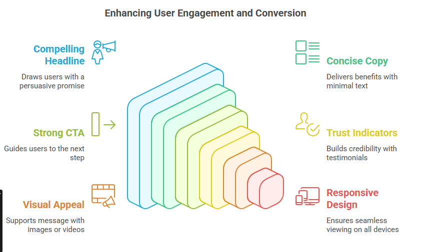
Write a Compelling Headline That Grabs Attention
Your headline is the first thing your visitor reads, and for most of them it will be the deciding moment. Research from SEO Sherpa confirms that 90% of visitors read both the headline and the CTA — these two elements together determine whether your page converts or not.
Headline optimization is the highest single-element ROI in landing page work. Across thousands of A/B tests, strong headlines deliver conversion lifts of 27 to 104% — more than any other isolated change you can make.
What Makes a High-Converting Headline
A strong headline does three things: states a clear benefit, speaks to a specific audience, and creates urgency or curiosity. Clarity wins over cleverness, every time.
Compare these three framings for the same product:
- Feature-led: "AI-Powered Analytics for SaaS Teams"
- Benefit-led: "Know Which Features Drive Retention, Not Just Revenue"
- Problem-led: "Stop Guessing Why Users Churn"
All three could be tested. The winner is whichever best matches what your visitor is thinking when they arrive.
Headline Testing Best Practices
Test one variation at a time against your current control. Run until you reach 95% statistical confidence. Never change your headline and CTA at the same time — you won't know which drove the result.
Start with benefit-led and problem-led framings. These consistently outperform feature-led headlines in head-to-head A/B tests across industries.
Create a Strong Value Proposition
Your value proposition answers the question every visitor silently asks: "Why should I choose you over everyone else?" Get this wrong and no amount of design or CTA optimization will save your conversion rate.
A value proposition is not a features list. It's a clear statement of the specific outcome you deliver, to whom, and why you're the best choice for delivering it.
Features vs. Benefits
- Feature: "256-bit SSL encryption"
- Benefit: "Your data is protected. No breaches, no leaks, ever."
Visitors buy outcomes, not specifications. Your value prop should be written entirely in terms of what the visitor gets — not what your product does.
Addressing Objections in Your Subheadline
Every visitor arrives with a silent objection. Acknowledge it directly. If price is a concern: "No contracts. Cancel anytime." If complexity is a concern: "Set up in 10 minutes, no dev required." Removing the objection early dramatically reduces decision friction.
As Rand Fishkin, founder of SparkToro, has argued: "The most effective landing pages don't sell products — they sell outcomes." Your value prop is the bridge between your visitor's pain and the outcome they want. The shorter that bridge, the higher your conversion rate.
Optimize Your Call-to-Action (CTA)
Your call to action (CTA) is the make-or-break moment of any landing page. Every other element — headline, design, social proof — exists to move your visitor toward clicking that one button.
Personalized CTAs convert 202% better than generic ones. That single stat explains why "Submit" and "Register" are the most expensive words on the internet.
CTA Copywriting Best Practices
Focus your CTA copy on what the visitor gets, not what they do:
- Instead of "Submit" — use "Get My Free Report"
- Instead of "Register" — use "Start My Free Trial Today"
- Instead of "Download" — use "Download the Full Guide Free"
Use first-person framing ("Get My...") wherever possible — it outperforms second-person ("Get Your...") in the majority of A/B tests.
CTA Placement Strategies
Your primary CTA must appear above the fold — visible before any scrolling. Add a secondary CTA at the page bottom for visitors who read everything before deciding.
Avoid multiple competing CTAs. Pages with two or more conflicting offers convert 266% worse than single-offer pages. One page, one goal, one CTA.
Designing Visually Prominent CTAs
Use a button color that contrasts sharply with your page background. Make the button large enough to tap on mobile (minimum 44px tap target). Add micro-copy directly below the button to reduce anxiety: "No credit card required" or "Cancel anytime."
Bottom line: Your CTA is a revenue switch. Test it relentlessly, design it for maximum contrast, and write copy that focuses entirely on your visitor's gain.
Improve Landing Page Design and User Experience
User experience (UX) on a landing page is not an aesthetic concern — it's a conversion concern. Every layout decision either guides your visitor toward the goal or creates friction that sends them away.
Nielsen Norman Group research consistently shows that visual hierarchy is the most powerful UX tool available. Your visitor's eye should move naturally from headline to value prop to CTA without effort. If it doesn't, your design is working against you.
Check Pixeto's guide on how to improve website user experience for a full breakdown of UX principles that apply directly to landing page architecture.
Visual Hierarchy
Use size, color, and contrast to direct attention. Your headline should be the largest text on the page. Your CTA should be the most visually distinctive element. Everything else supports these two anchors. If your visitor doesn't know where to look in the first 3 seconds, your hierarchy isn't working.
Mobile-Responsive Design
86% of top-performing landing pages are explicitly mobile-optimized (SEO Sherpa, 2026). Mobile-first design means designing for the smallest screen first, then scaling up. Buttons need to be easy to tap. Copy must be readable without zooming. Test on a real device, not a browser simulation.
White Space and Readability
White space is not wasted space — it's breathing room that helps visitors focus. Dense, cluttered pages feel overwhelming and erode trust. Clean pages feel confident and professional. Give your headline and CTA room to breathe.
Reducing Distractions
Remove your navigation menu from landing pages. Every outbound link is an exit route. Keep your visitor focused on the single action you want them to take — nothing else.
[IMAGE: Side-by-side comparison of a cluttered landing page vs. a clean single-CTA page showing UX best practices]
Reduce Form Friction to Increase Conversions
Forms are where conversions happen — and where most landing pages leak the most. 81% of users abandon a form after starting it, and 67% never return.
The most impactful fix you can make today: reduce your form fields. Reducing from 11 fields to 4 increases conversions by 160%. Start with the absolute minimum you need — name and email alone is often enough at the top of your funnel.
Multi-Step vs. Single-Step Forms
Multi-step forms outperform single-step forms when the total field count is high. Breaking a 10-field form into 3 shorter steps makes the task feel less daunting. Progress indicators keep users moving forward.
Use single-step forms when you need 3 fields or fewer. Use multi-step when you genuinely need more information — and always show progress clearly at each step.
Building Trust During Form Completion
Add a privacy reassurance line directly below your submit button: "We never share your data. Unsubscribe anytime." This addresses the security concerns that cause 29% of all form abandonment.
Enable autofill wherever possible. Small friction points compound — each unnecessary tap represents a percentage of visitors who give up. The Baymard Institute confirms that perceived form complexity is a leading driver of abandonment even when the form is objectively short.
Form Testing Strategies
Test your form length, field order, and label copy. A label that reads "Work Email" converts better than "Email Address" on B2B pages because it pre-qualifies intent. Test one variable at a time and let statistical significance guide your decisions.
Build Trust with Social Proof and Trust Signals
Your visitors arrive skeptical. They've seen hundreds of landing pages making the same promises. Trust signals are how you prove yours is different — and how you make the conversion feel safe.
Customer testimonials increase conversions by 34%. Video testimonials outperform text testimonials by up to 86% (Genesys Growth, 2026). If you have one strong video testimonial from a real customer, it belongs above the fold.
When evaluating landing page design partners, look for teams that understand how trust architecture integrates with conversion goals — not just visual polish. Pixeto's work with WhizAI shows what this looks like in practice: restructured trust signals and clearer positioning led to a measurable lift in qualified lead submissions.
Customer Reviews and Testimonials
Specific, recent, and verified reviews outperform vague praise. "This tool saved us 4 hours a week" converts better than "Great product!" The more concrete the outcome in the testimonial, the more trust it builds.
Client Logos and Partnerships
A logo strip communicates instant credibility. Visitors recognize brands they trust — seeing that those brands chose you reduces their own perceived risk. Place your strongest logos at eye level, above the fold.
Security Badges and Certifications
SSL certificates, GDPR compliance marks, and payment security logos (PCI DSS, Stripe, PayPal) all signal that completing your form is safe. Place them directly adjacent to your form submit button — where the anxiety is highest.
Case Studies with Specific Outcomes
Numbers build more trust than adjectives. "Increased qualified leads by 47% in 60 days" is 10x more credible than "significantly improved results." Link to the full case study so visitors can verify the claim.
Statistics and Credibility Indicators
Third-party data cited inline with a linked source signal authority. "According to Unbounce's Conversion Benchmark Report, the top 25% of landing pages convert at over 11%" is more persuasive than any claim you make about your own product.
Optimize Page Load Speed and Mobile Performance
Page load speed is not a technical concern — it's a conversion concern. A 1-second delay in load time reduces your conversion rate by 7%. Pages loading in 1 second convert 3x higher than pages loading in 5 seconds.
Google's Core Web Vitals define your performance targets:
- LCP (Largest Contentful Paint): Under 2.5 seconds
- FID (First Input Delay): Under 100ms
- CLS (Cumulative Layout Shift): Under 0.1
53% of mobile users abandon any page taking more than 3 seconds to load. Every second you cut from your load time is a direct, measurable conversion gain.
Key Technical Optimizations
- Compress images to WebP format, targeting under 100KB per image
- Use lazy loading for all images below the fold
- Minify CSS, JavaScript, and HTML
- Serve assets through a CDN closer to your visitors' locations
- Audit and remove all third-party scripts that don't contribute to conversion
Tools to measure and fix your page speed: Google PageSpeed Insights, Lighthouse, and GTmetrix. Run your page through all three before and after any performance change.
Watch: 10 Best Landing Page Optimization Tips
Use A/B Testing to Continuously Improve Results
A/B testing is the only way to know with certainty what actually improves your landing page. You create two versions of a page element, split traffic between them, and measure which produces more conversions.
Only 17% of marketers run A/B tests, despite the fact that companies that test consistently see a 37% average conversion improvement (Genesys Growth, 2026). That's one of the starkest ROI gaps in digital marketing — and it's yours to close.
Elements Worth Testing (Prioritized)
Best for: Teams with existing traffic who want fast, data-confirmed wins without a full redesign.
Statistical Significance Basics
Do not stop a test early because one version appears to be winning. Wait until you reach 95% statistical confidence. Low-traffic tests with small samples produce false positives — and false positives lead to bad decisions.
Test one element at a time. If you test two changes at once, you cannot attribute the result to either.
Creating a Testing Roadmap
Start with headlines and CTA copy — highest impact, lowest implementation cost. Move to form optimization. Then layout. Then imagery and video. Treat your testing roadmap as a permanent fixture of your marketing operation, not a one-time project.
Watch: How to A/B Test a Landing Page in Instapage
Analyze User Behavior and Conversion Data
A/B testing tells you what converts better. Behavioral analysis tells you why — and that layer is where most teams find their biggest breakthroughs.
Heatmaps show where visitors click, what they scroll past, and where attention drops. Session recordings let you watch real users navigate in real time. Both reveal friction you'd never find by looking at the page yourself.
Heatmaps and Scroll Depth
If 70% of your visitors exit before reaching your CTA, your headline isn't doing its job. Scroll depth analysis reveals this instantly. Heatmaps show whether visitors are clicking on elements that aren't clickable — a surprisingly common source of silent frustration.
Bounce Rate Evaluation
A high bounce rate almost always signals a mismatch between your ad message and your landing page content. Fix the message alignment first before making any other optimization. Hotjar's research confirms that message mismatch is the leading cause of landing page bounce — not design or speed.
Conversion Funnel Tracking
Set up goal tracking in Google Analytics 4 so you can see exactly where visitors drop out of your conversion flow. Is it the form? The pricing section? The testimonials area? Each drop-off point is a testable hypothesis.
User Feedback Collection
Collect direct feedback with a one-question exit survey: "What stopped you from signing up today?" The answers will tell you more about your page's real problems than any heatmap alone. Microsoft Clarity offers free heatmaps, scroll maps, and session recordings — a strong starting point for behavioral analysis with no budget required.
Common Landing Page Optimization Mistakes to Avoid
Most landing pages fail for the same predictable reasons. Here are the most common, and the one-line fix for each:
Weak Headlines
Your headline doesn't communicate a clear benefit in the first 5 words. Fix: Rewrite it to answer "What do I get?" — benefit-first, specific, under 10 words.
Unclear Value Propositions
Visitors can't tell what makes you different from the three other tabs they have open. Fix: Add a one-line differentiator as your subheadline. Specific, benefit-led, and distinct from your competitors.
Too Many CTAs
Competing calls to action create decision paralysis and reduce conversions by 266%. Fix: One page, one goal, one CTA. Remove everything else.
Slow Loading Pages
Every extra second costs 7% of your conversions. Fix: Run Google PageSpeed Insights right now and address the top three issues this week.
Poor Mobile Experience
Your page looks great on desktop but loses 83% of your audience on mobile. Fix: Test on a real mobile device. Tap every button. Read every line without zooming.
Lack of Trust Signals
No social proof means no credibility, and no credibility means no conversion. Fix: Add at minimum one customer testimonial and one trust badge above the fold — before the visitor has to scroll.
Ignoring Analytics Data
Optimizing by gut feel is expensive guesswork. Fix: Set up conversion tracking in GA4 and run your first heatmap this week. Let the data lead, not your instincts.
Final Verdict: How to Optimize Landing Pages for Higher Conversions
How to optimize landing pages successfully comes down to understanding user intent, delivering a compelling value proposition, reducing friction, and continuously testing improvements based on real user data.
The highest-converting pages aren't the flashiest. They're the most intentional. Every element has a job, every change is measured, and every decision is validated by data rather than opinion.
Start with the three highest-impact changes: headline copy, CTA copy, and form length. These three alone can double your conversion rate without a single design change. Once those are tuned, layer in behavioral analytics, page load speed improvements, and a systematic A/B testing cadence.
Optimized Page vs. Poorly Optimized Page
For landing page design that integrates conversion architecture with high-performance UX, explore Pixeto's SaaS landing page best practices — and how top-converting pages are actually built.
See also: Improve Website Conversion Rate: Proven CRO Tips, Landing Page vs Website: Which Should You Use?, and the Website UX Checklist.
Key Takeaways
- Landing page optimization is a continuous process — not a one-time fix
- Headlines and CTAs deliver the highest optimization ROI of any single element
- Keep forms to 5 fields or fewer — shorter forms convert up to 160% better
- Page load speed directly impacts revenue: every 1-second delay costs 7% of conversions
- A/B testing consistently delivers 37% more conversions for teams that commit to it
- Trust signals (testimonials, badges, case studies) reduce bounce rate and build credibility
- UX and conversion rate optimization must work together — not as separate workstreams
FAQs
What is landing page optimization?
Landing page optimization is the process of improving a landing page's design, copy, and performance to increase the percentage of visitors who take a desired action. It uses behavioral data, A/B testing, and UX best practices to drive higher conversion rates across goals like signups, lead capture, and direct sales.
Why is landing page optimization important?
Traffic is expensive and wasted if your page doesn't convert. Even a 1% lift in conversion rate dramatically impacts revenue. With rising ad costs and more competition for attention, maximizing the traffic you already have is the highest-ROI move available to any growth-focused team.
How can I improve my landing page conversion rate?
Start with your headline and CTA — both have the highest individual impact. Then reduce form fields, add social proof above the fold, and ensure your page loads in under 2.5 seconds. Use A/B testing to validate each improvement and heatmaps to find friction you're currently missing.
What makes a landing page high-converting?
A high-converting page has one clear headline matched to visitor intent, a single focused CTA, minimal form friction, strong social proof, and fast page load speed. It removes navigation, eliminates competing offers, and makes the next step obvious and low-risk for the visitor.
How important is page speed for landing page performance?
Critical. A 1-second delay reduces conversion rate by 7%. Pages loading in 1 second convert 3x higher than pages at 5 seconds (Google Web Vitals). Target an LCP under 2.5 seconds. Mobile visitors are especially sensitive — 53% abandon any page taking over 3 seconds to load.
What should a landing page CTA say?
Your CTA should focus on what the visitor gets, not what they do. Replace "Submit" with "Get My Free Guide." Replace "Register" with "Start My Free Trial." Personalized CTAs convert 202% better than generic versions. Keep it short, specific, and benefit-driven.
How many form fields should a landing page have?
Five or fewer. Reducing from 11 fields to 4 increases conversions by 160% (Genesys Growth, 2026). For top-of-funnel lead capture, name and email alone is often enough. Only ask for information you genuinely need at that specific funnel stage.
What are trust signals on a landing page?
Trust signals reduce visitor skepticism: customer testimonials, star ratings, client logos, SSL/GDPR badges, industry certifications, and case studies with specific measurable results. Testimonials alone boost conversions by 34%. Place your strongest trust signal above the fold — before the visitor has to scroll.
How does A/B testing improve landing page conversions?
A/B testing removes guesswork from optimization. You split traffic between two page versions and measure which performs better at statistical confidence. Companies that test consistently see 37% more conversions than those that don't. Start with headlines and CTA copy — these deliver the fastest, most measurable results.
What is a good landing page conversion rate?
The industry median is 6.6% across all industries (Unbounce, 2024). Top performers reach 3x the median — 11–26% depending on sector. For SaaS, 3.8% is average and 11.6% is top quartile. Your goal is to beat your own baseline through consistent testing and iteration.
How often should I optimize my landing pages?
Continuously. Review bounce rate, scroll depth, and conversion rate trends monthly. Run at least one A/B test per month. Refresh copy and social proof quarterly. Plan major redesigns every 12–18 months, or when your data shows a plateau that testing alone can't break through.
What tools can I use to analyze landing page performance?
- **Google Analytics 4:** Funnel tracking and conversion goal measurement
- **Hotjar or Microsoft Clarity:** Heatmaps, scroll maps, and session recordings (Clarity is free)
- **Google PageSpeed Insights / Lighthouse:** Page load speed and Core Web Vitals
- Optimizely or VWO: Dedicated A/B testing platforms
- **Google Search Console:** Organic landing page performance and click data


.svg)

